
Gallery of Pots
Potters glaze their work to give texture, colour, a decorative effect and to make a pot waterproof and therefore functional. The broad and varied techniques emerging from The Clay Yard ceramics studio are illustrated and explained in the gallery below.
-
Slip Decoration
-
-

Liquid Clays
Stains added to a white base stoneware give the potter a chance to build texture and colour into the surface. Slips do not blend to give a new tone so are best used for layering or block colour. Two or three layers on leather-hard will give good coverage. Force dry using a hot-air gun (take care - it’s hot) between each layer to avoid brushing to expose the uncoloured clay beneath.
Glazes
The glaze palette at the studio has been developed over time in order to provide our potters with a broad and safe range of glazes that use materials that have minimal impact on the environment.

Carol's beautiful slab-built pot with copper oxide under moss green.
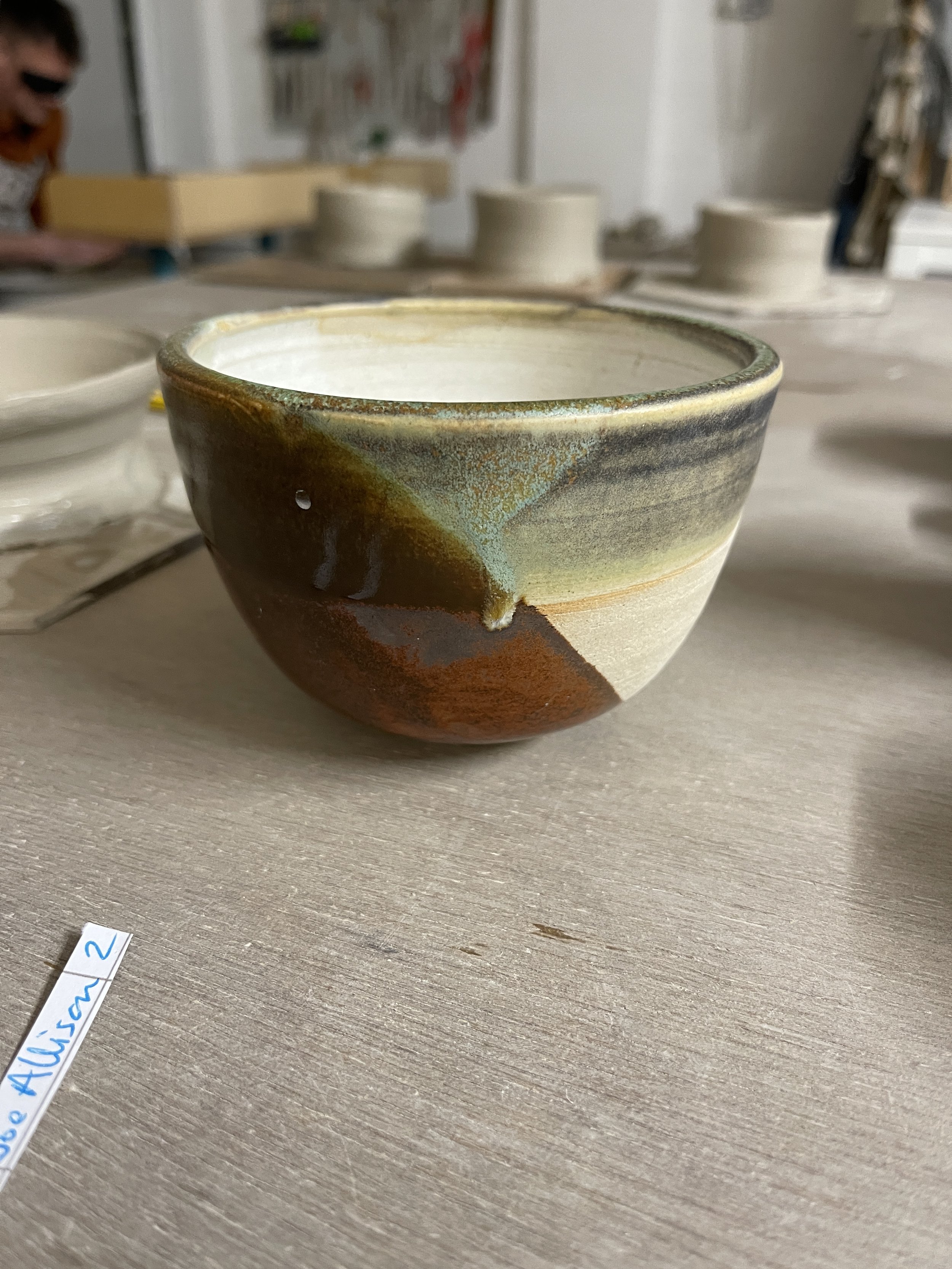
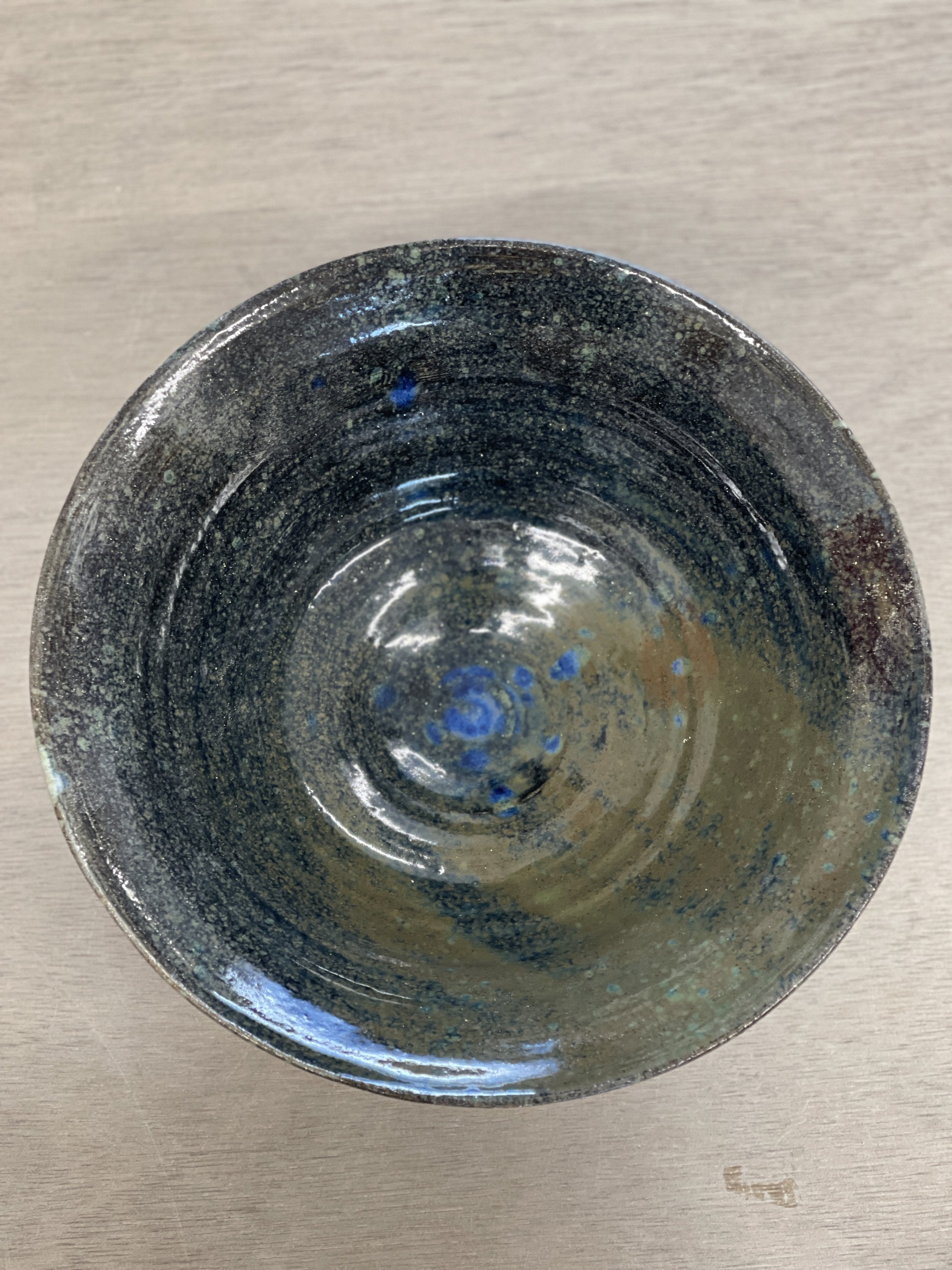
Jess's thrown bowl with a celadon green rim over copper red. Hue of migrating iron gives the orange line.
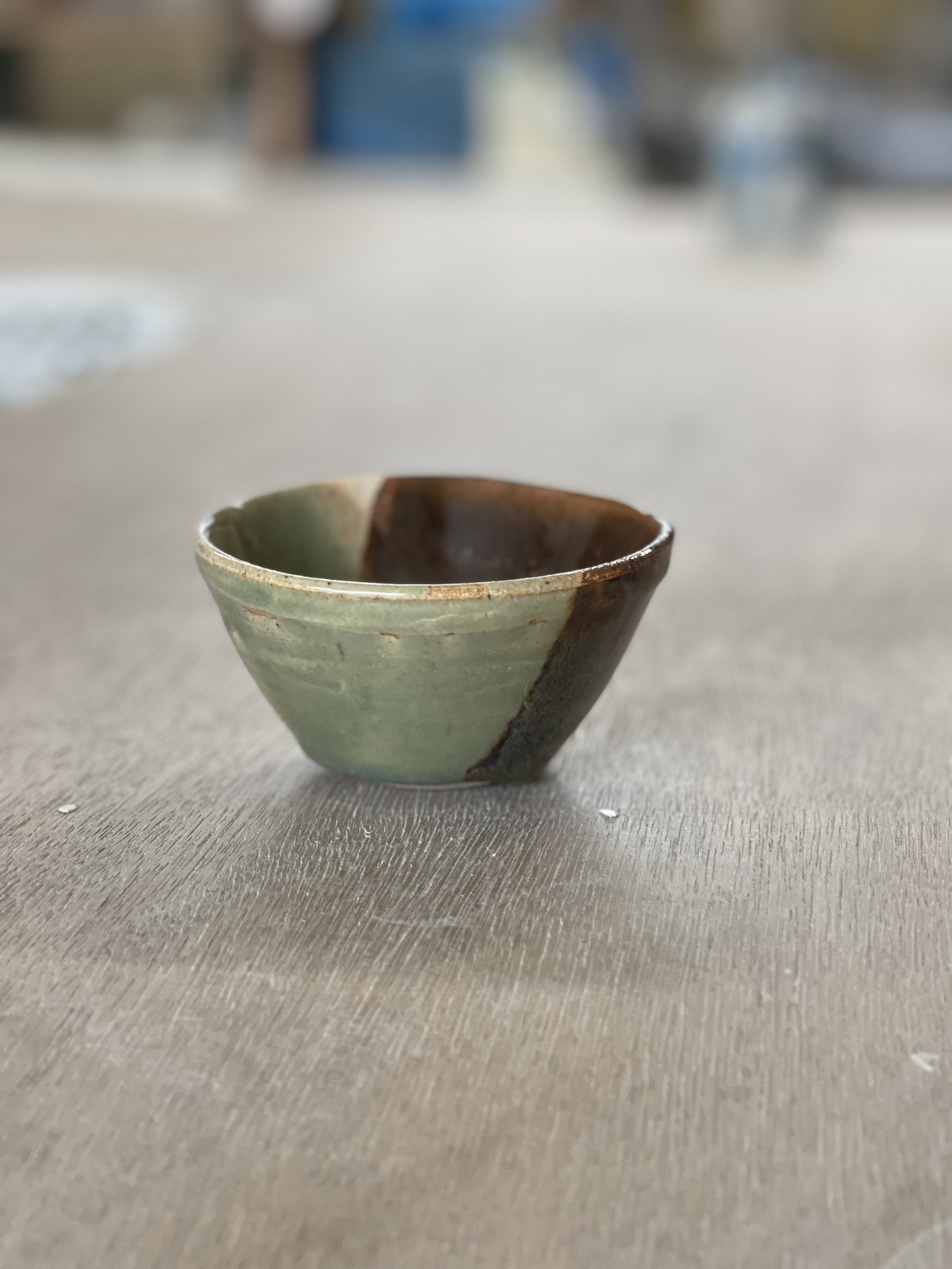
Copper red overlapping with celadon green (or could possibly be our reclaimed blend).
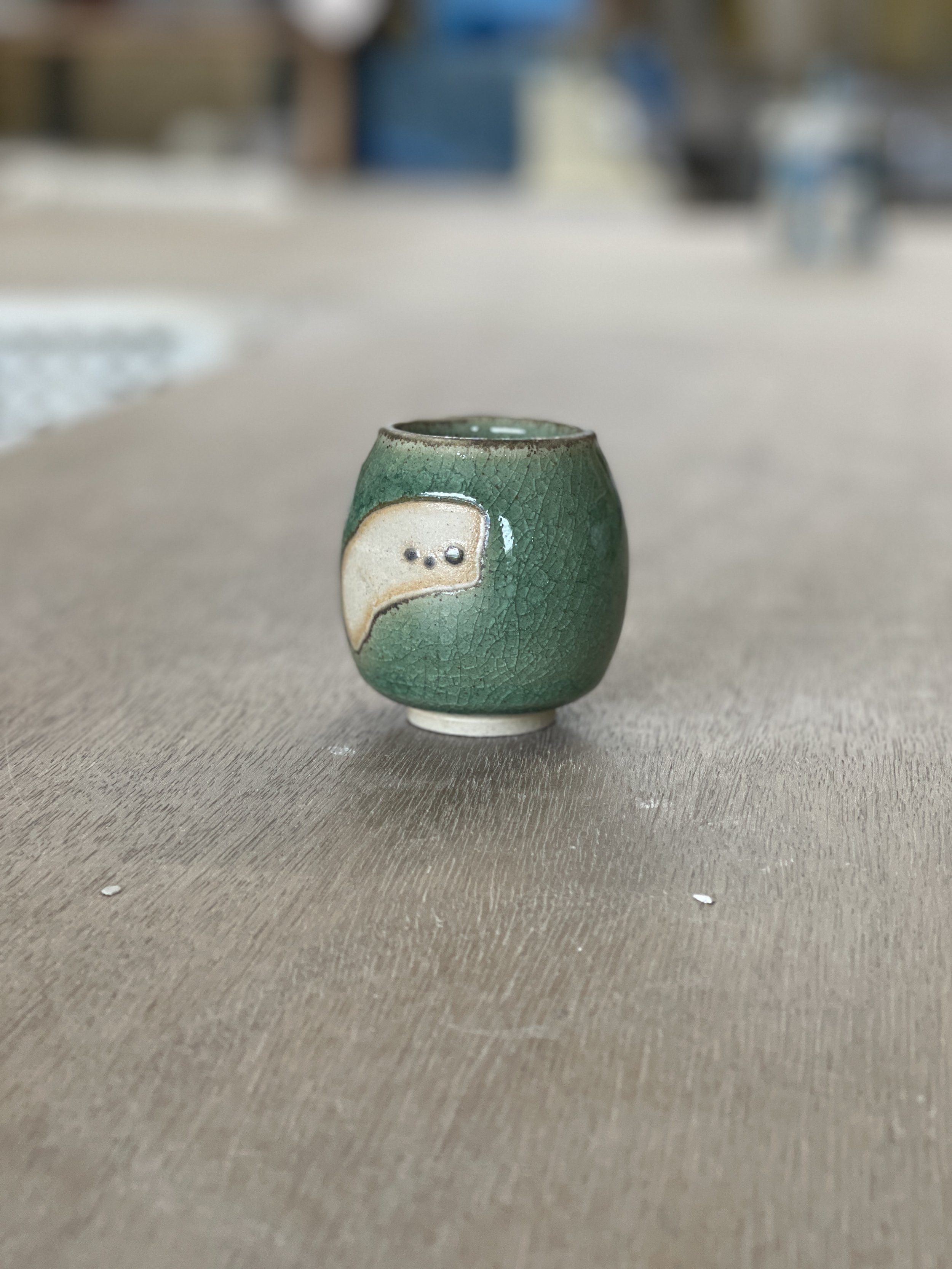
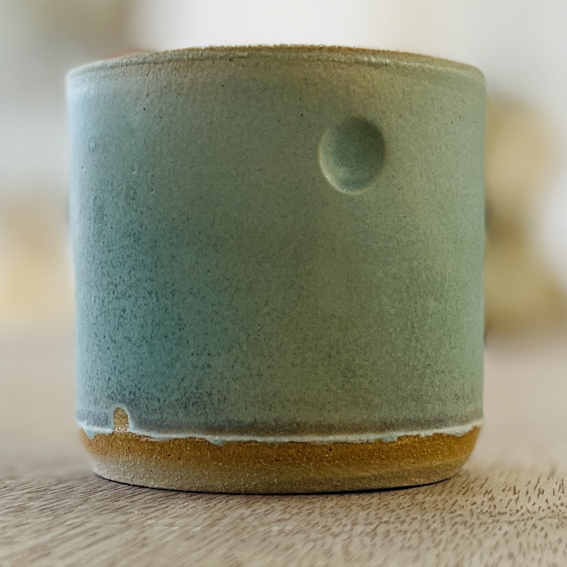
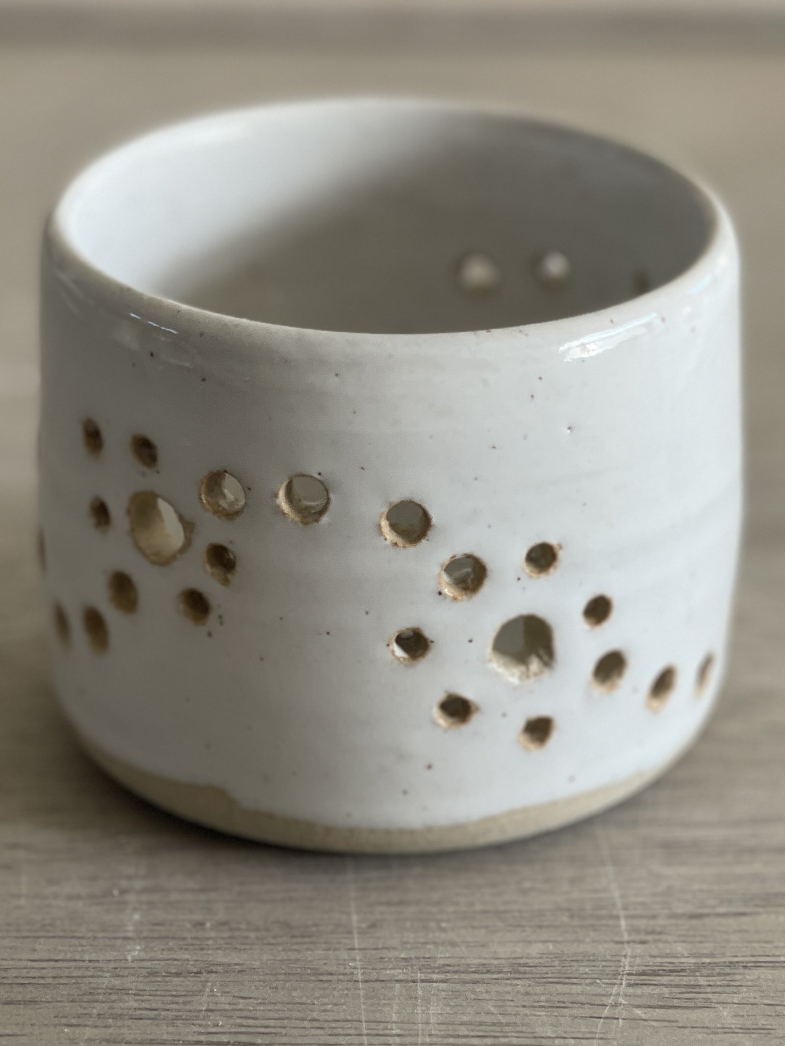
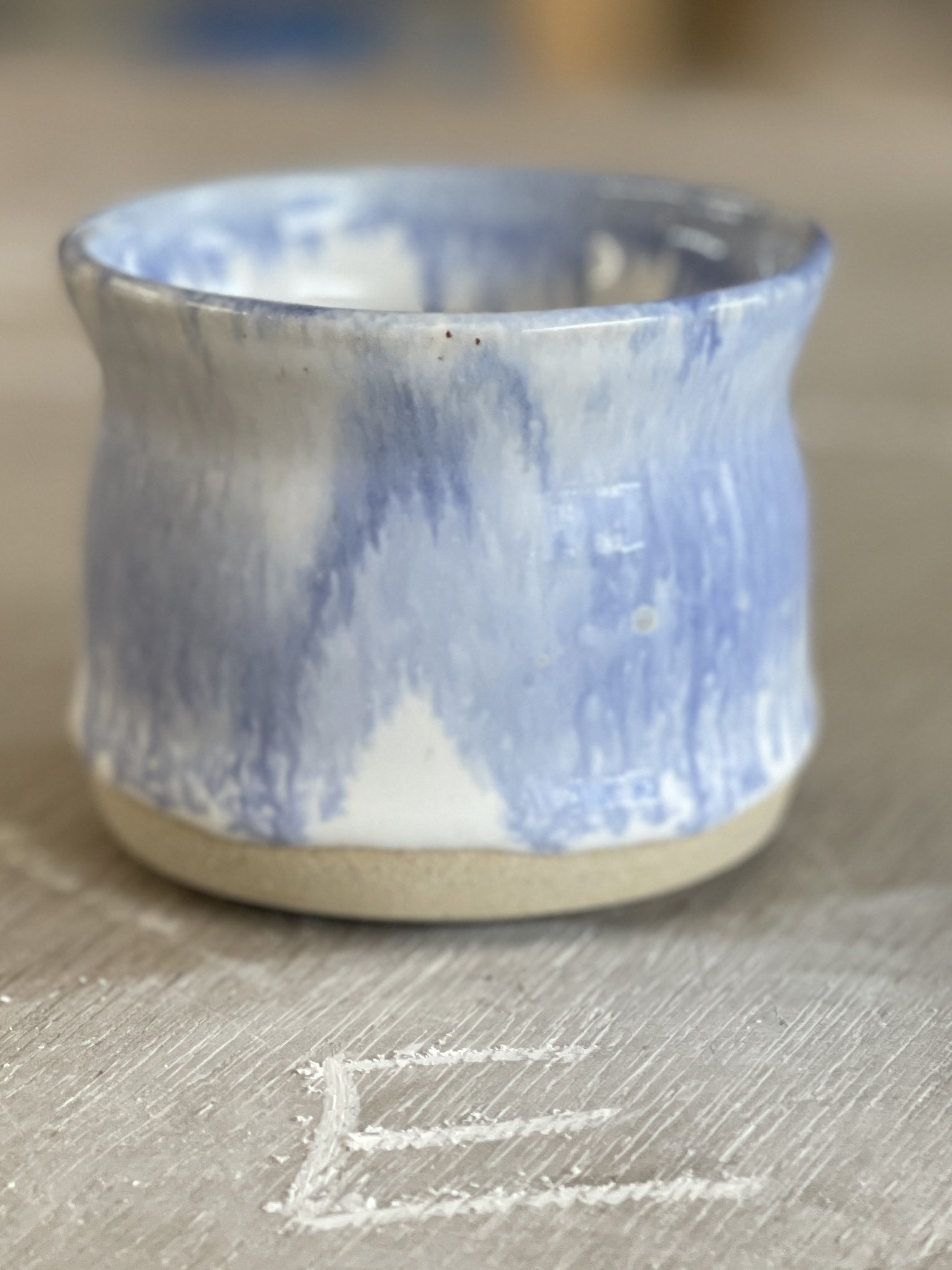
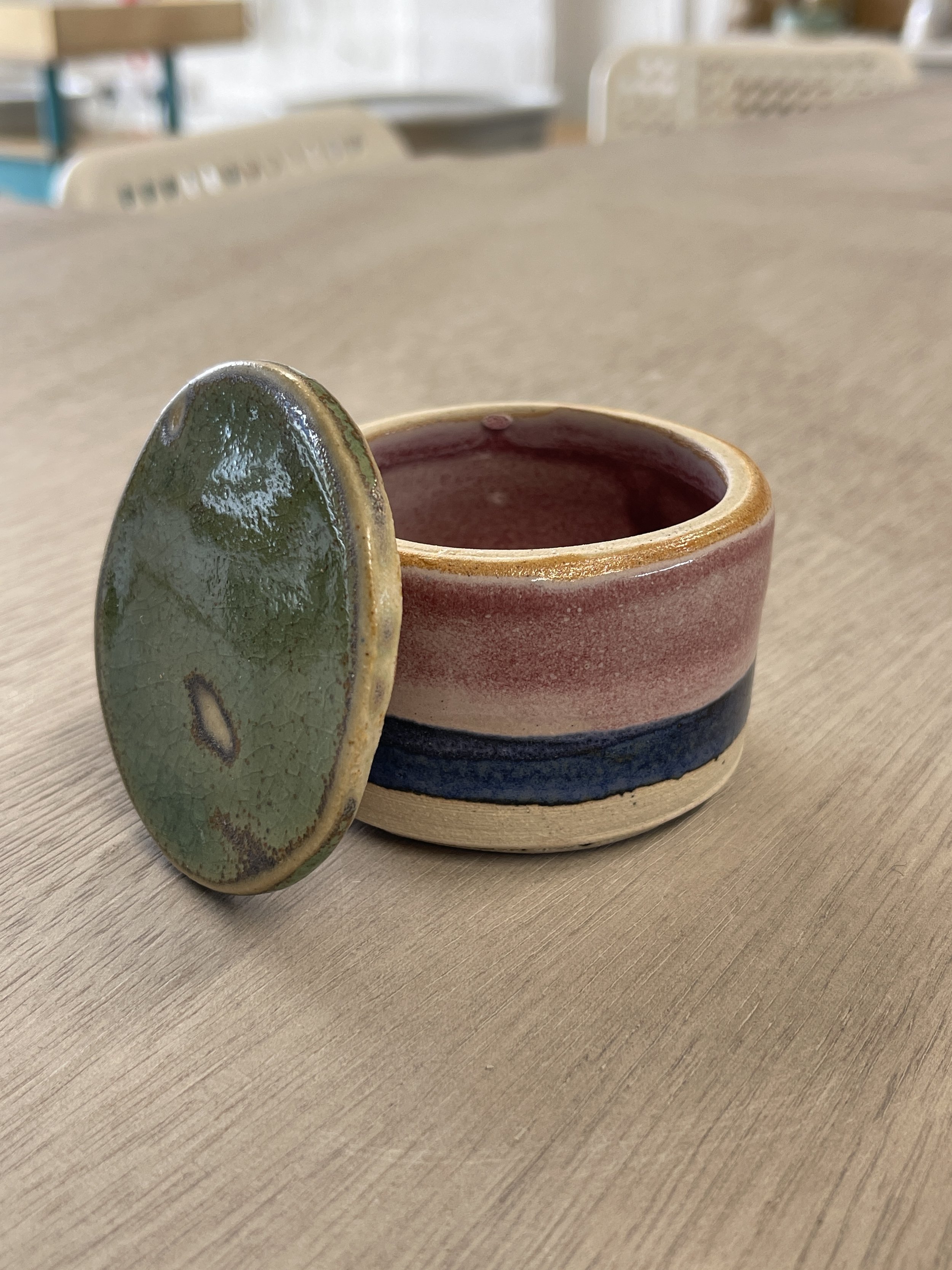
Beautiful and humble little pot with a dash of wax resist with three curious little dots of joy.
The Celadon Green banding is painted on (on the potters' wheel) in layers - a good coating leaves a beautifully glossy finish.
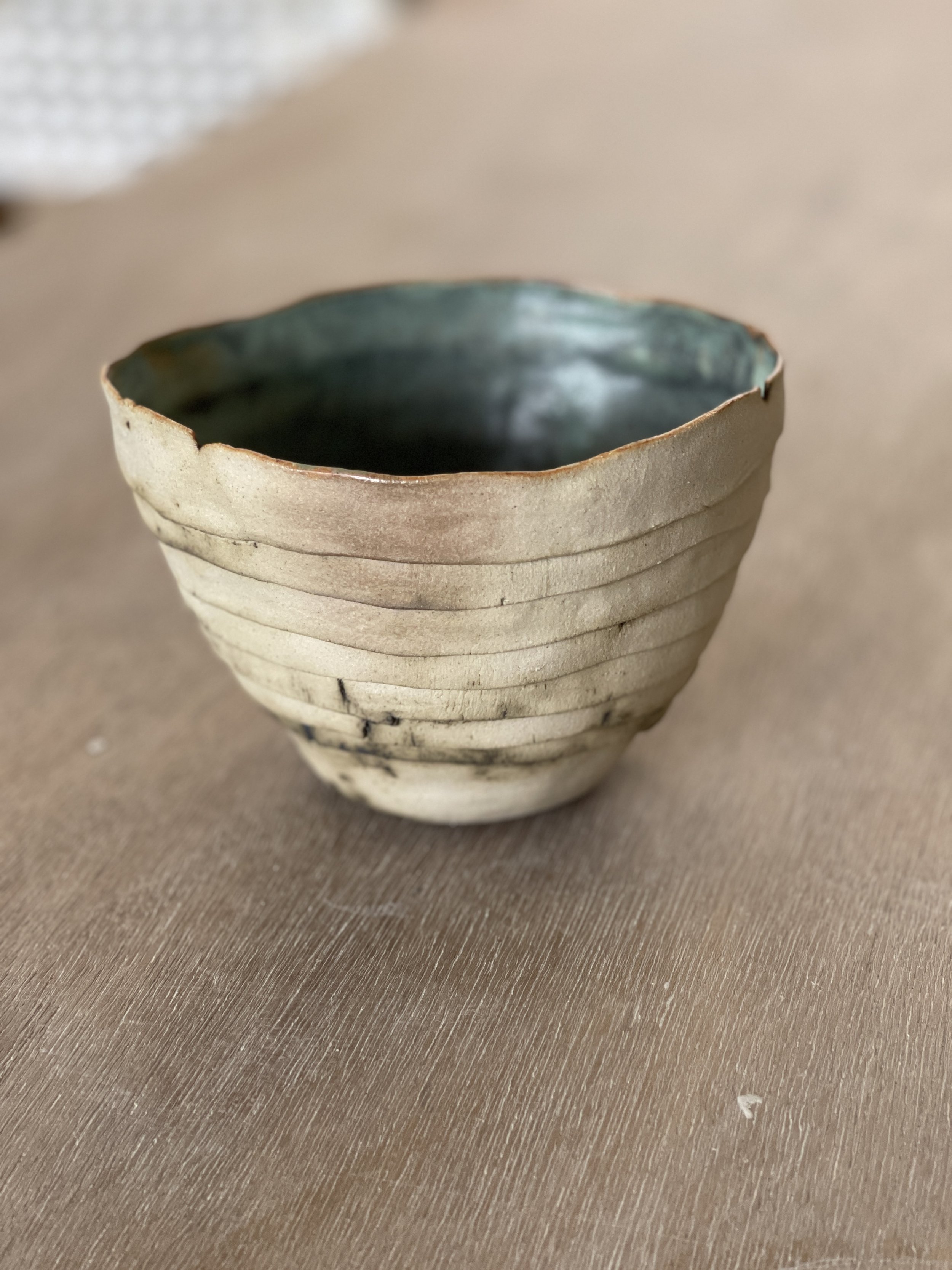
Celadon Green with Copper Oxide in texture of the clay.
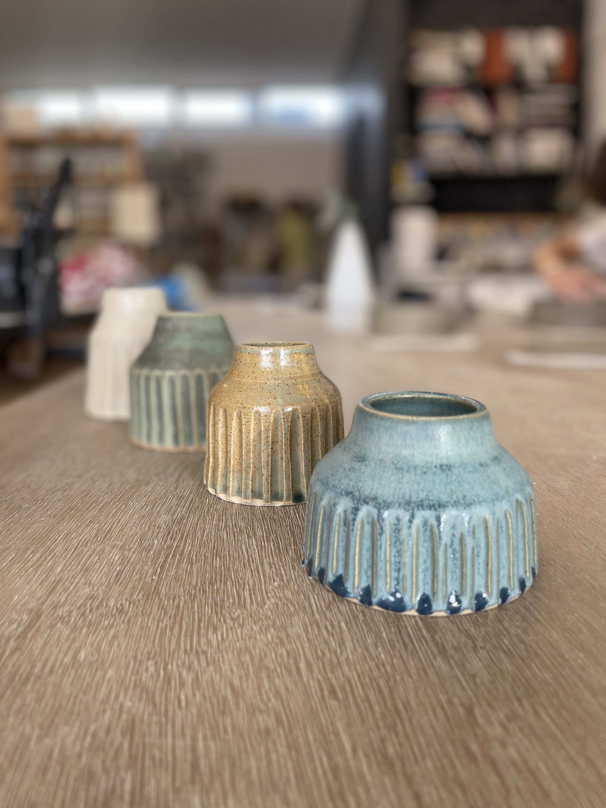
Celadon Green - double dip over quick dip gives lovely tapered effect.
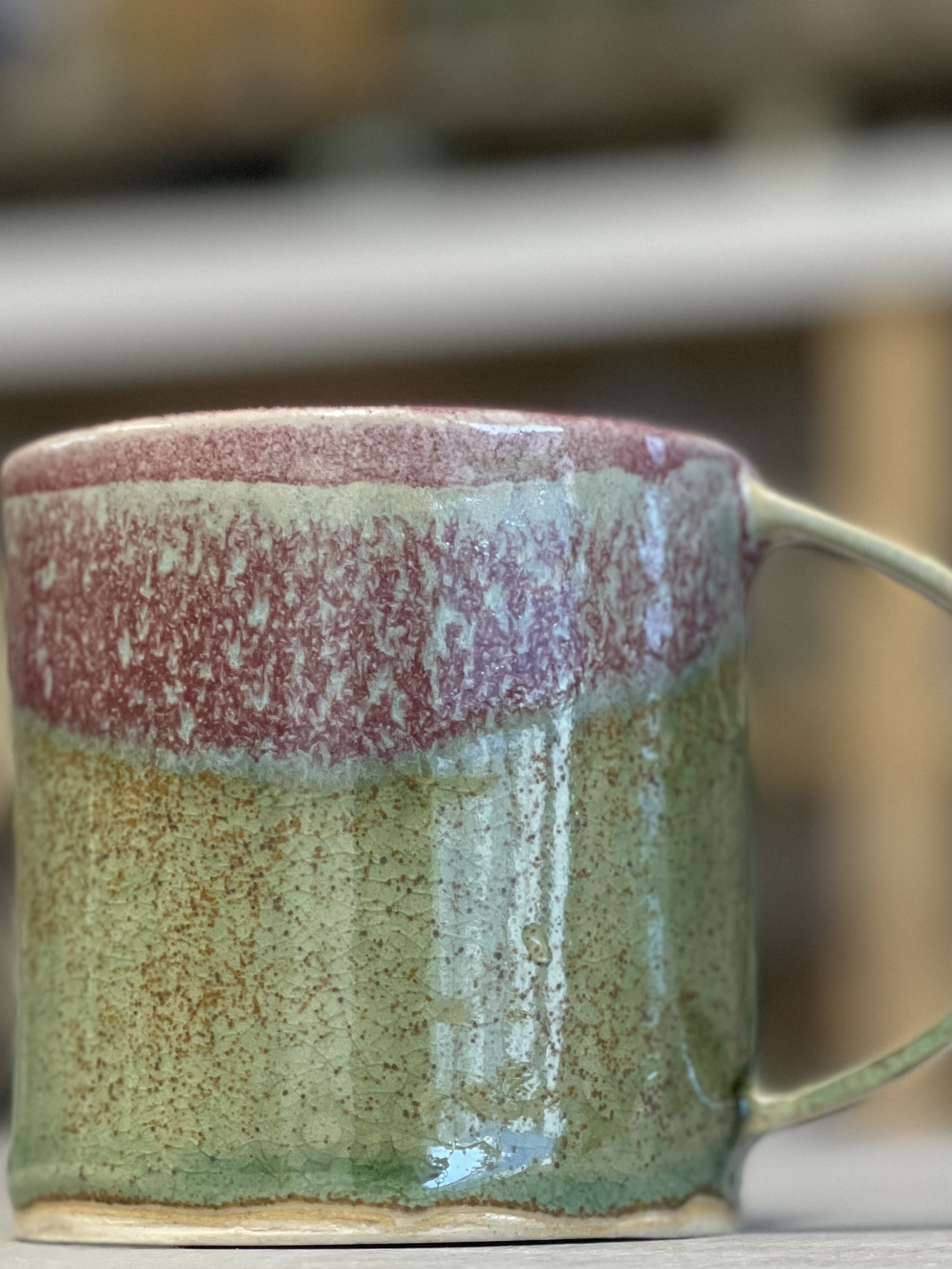
Celadon Green with Amaryllis Pink gives a turquoise hue.
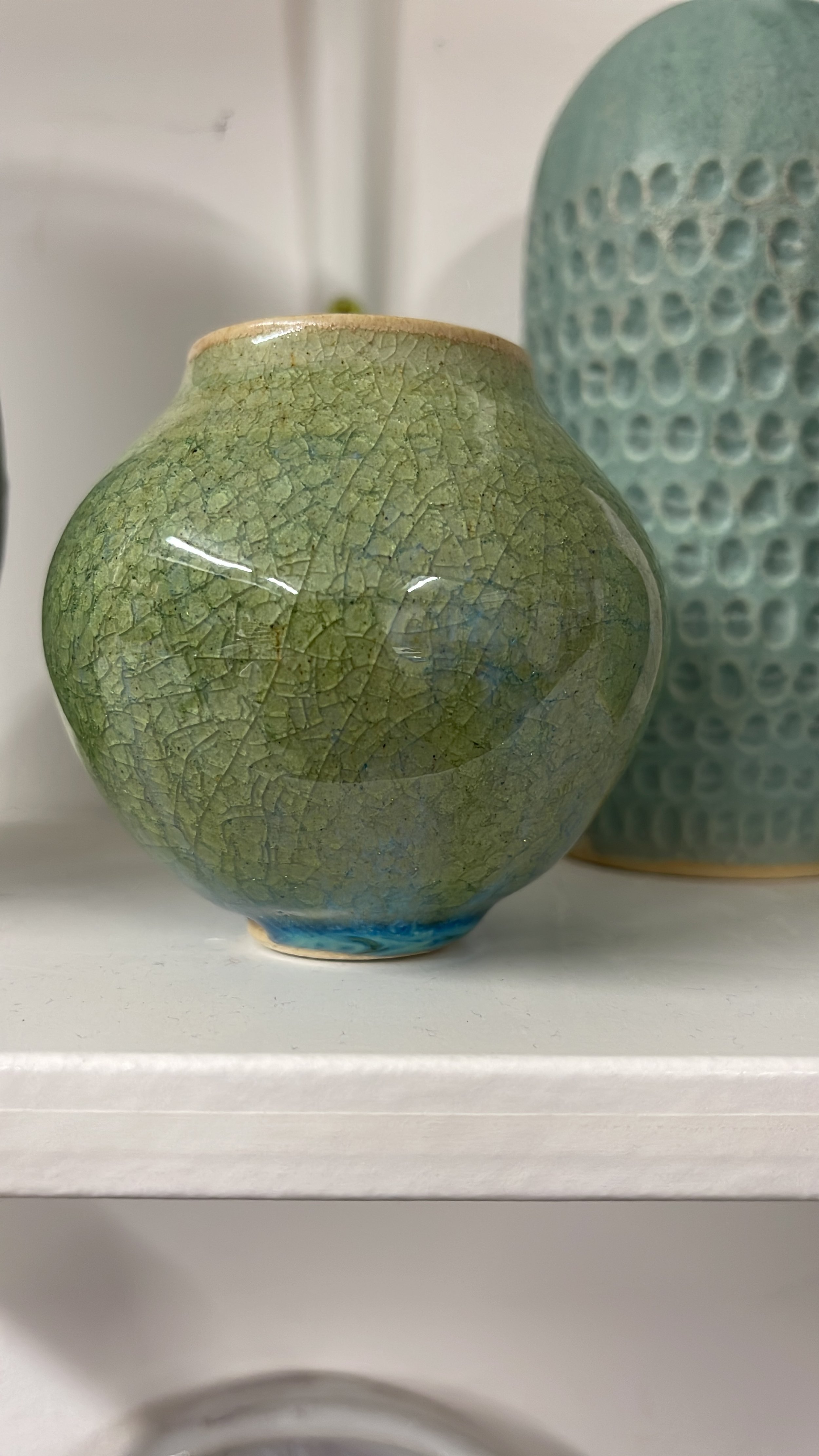
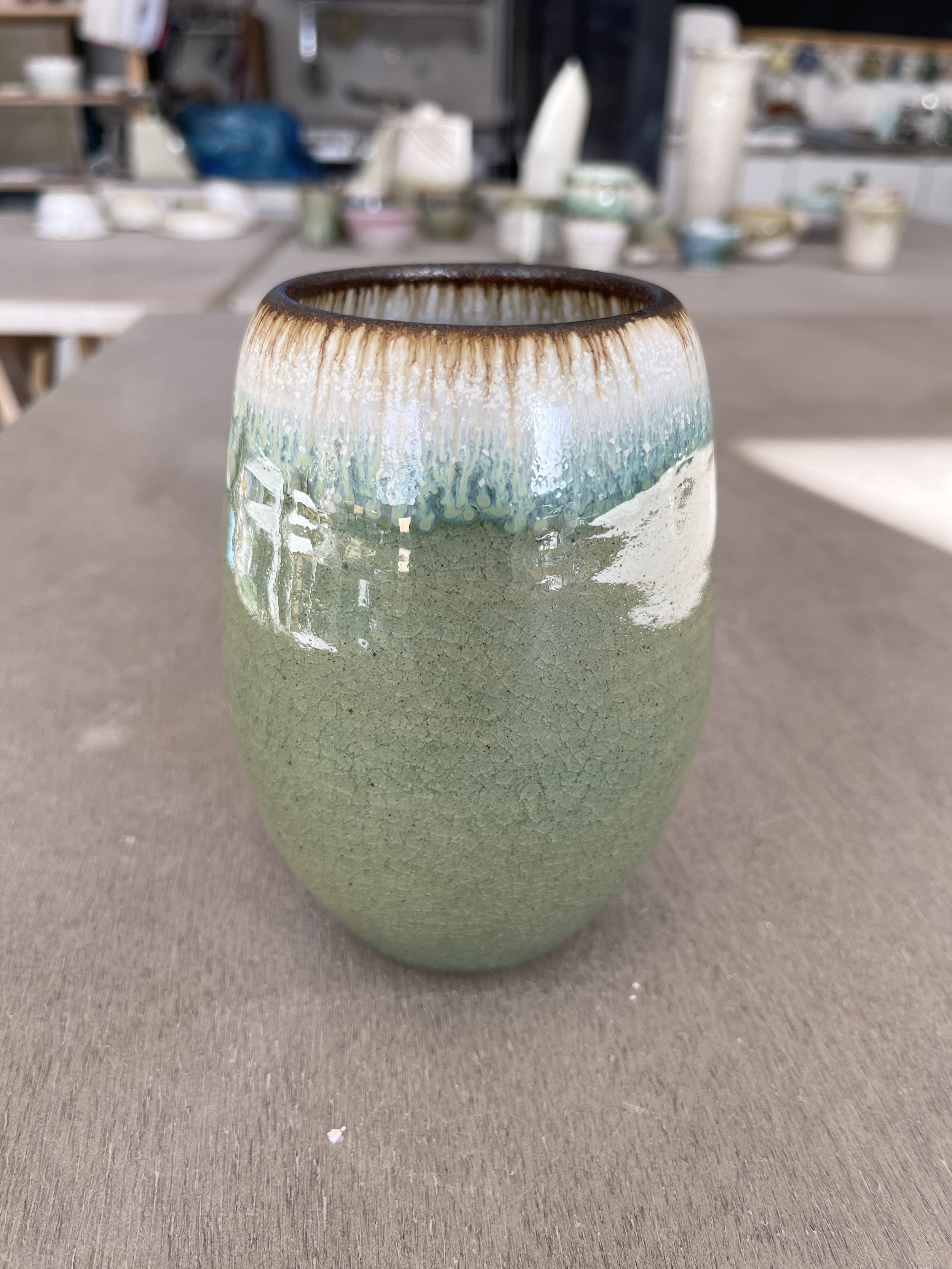
Celadon Green with a crackle effect which happens when a thick coat (longer dip) is applied. Not always guaranteed.
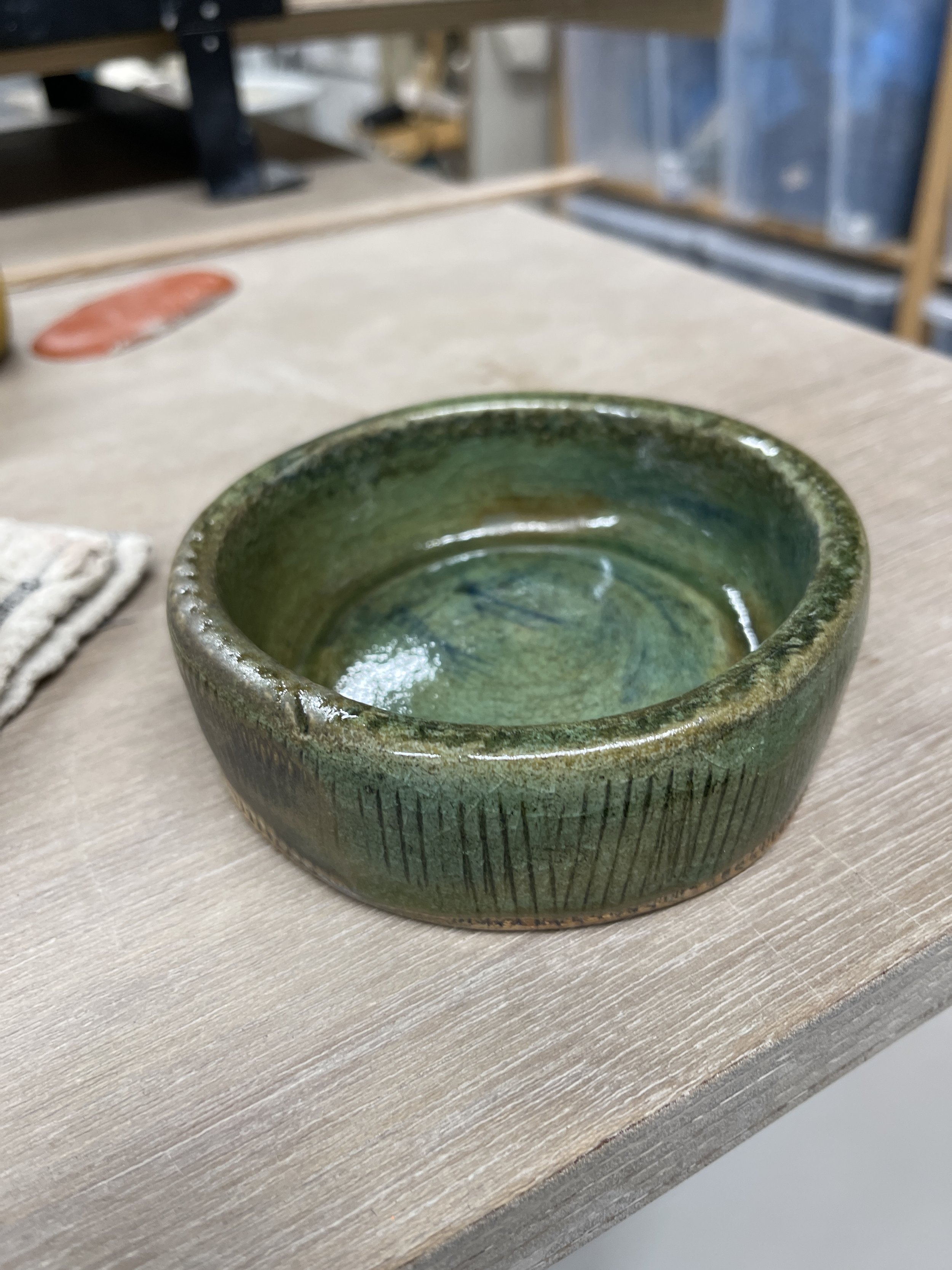
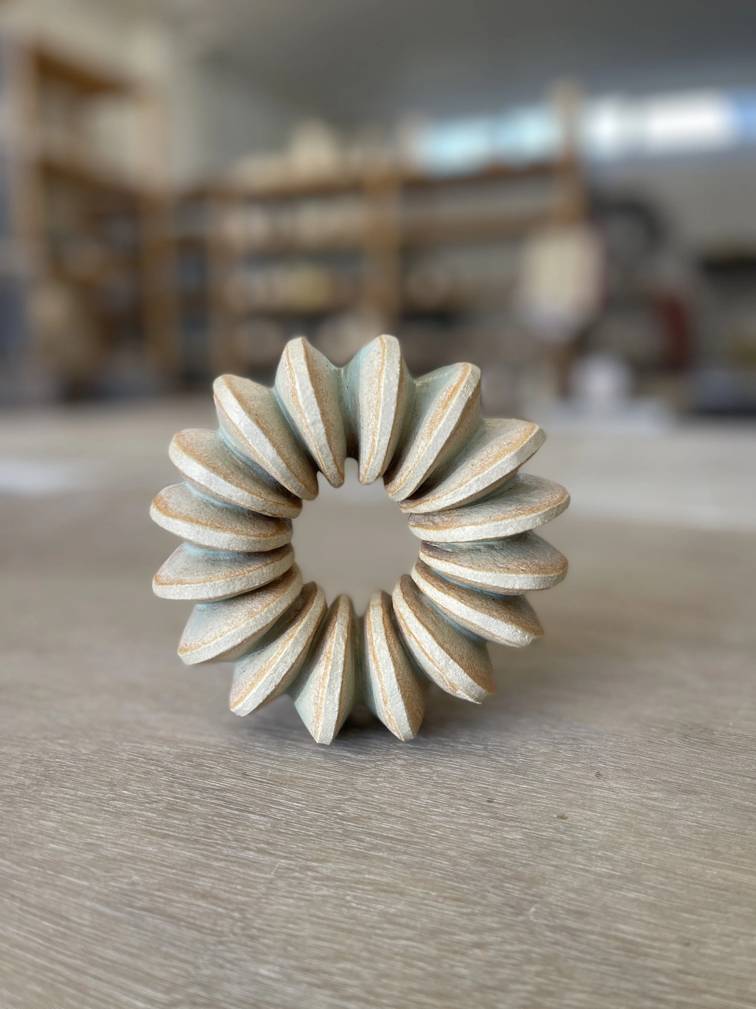
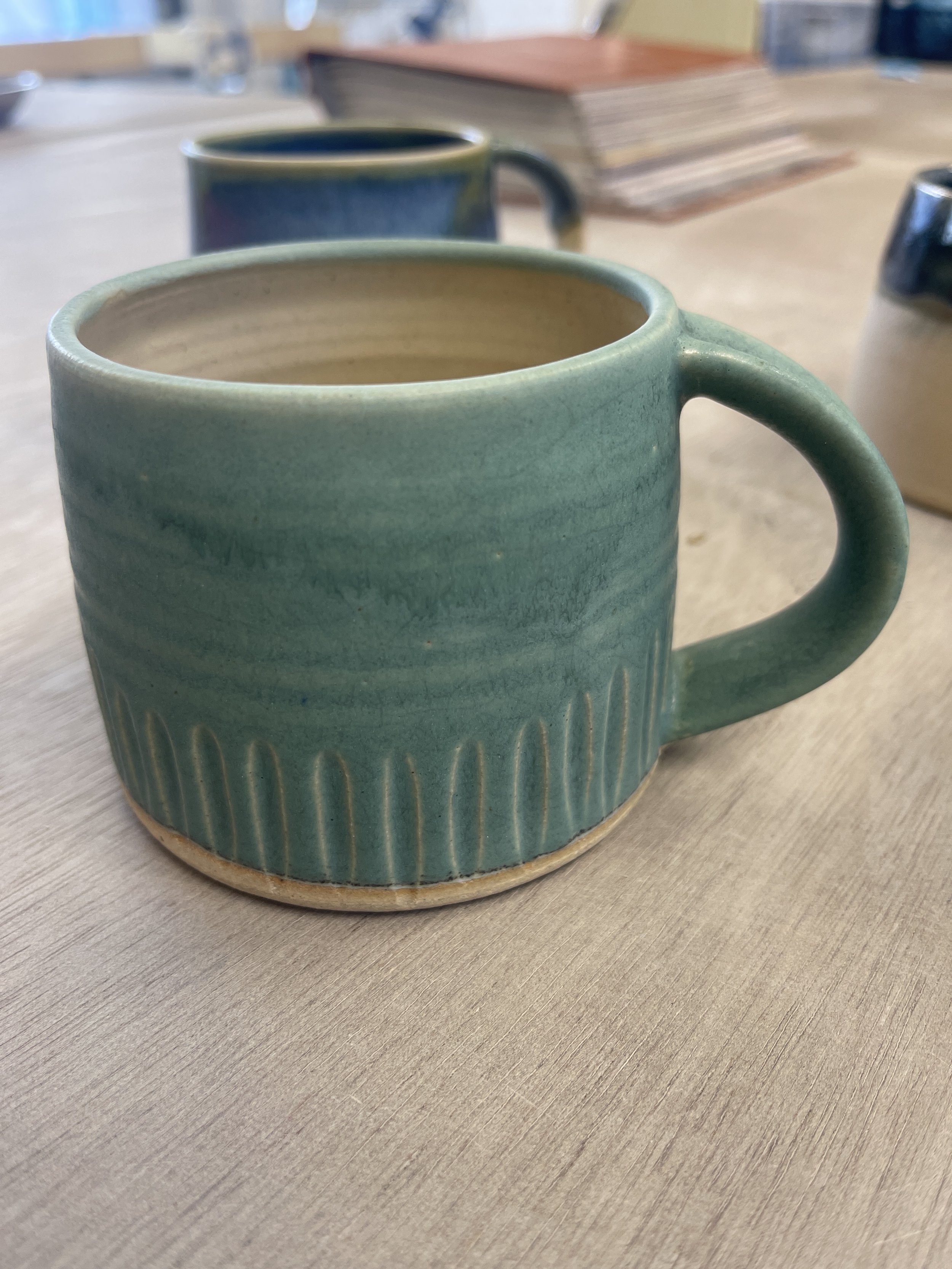
Celadon Green enhances texture.
Almond white rim over celadon green body with a red/black iron oxide layer on rim.
Celadon Green with almond white. Dark black/brown is usually where the glaze is thinner.
Celadon Green cup with white pot and red iron oxide.
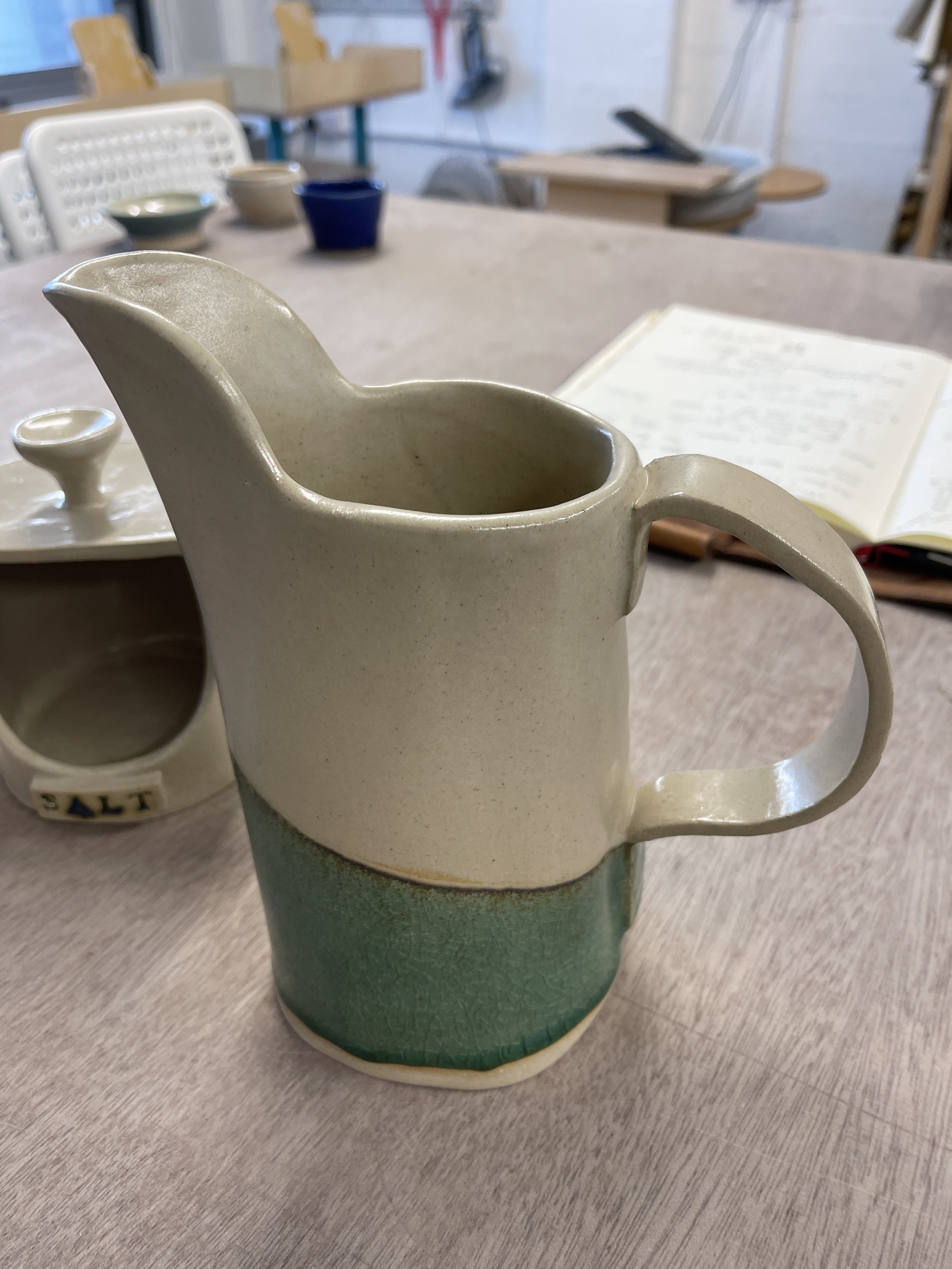
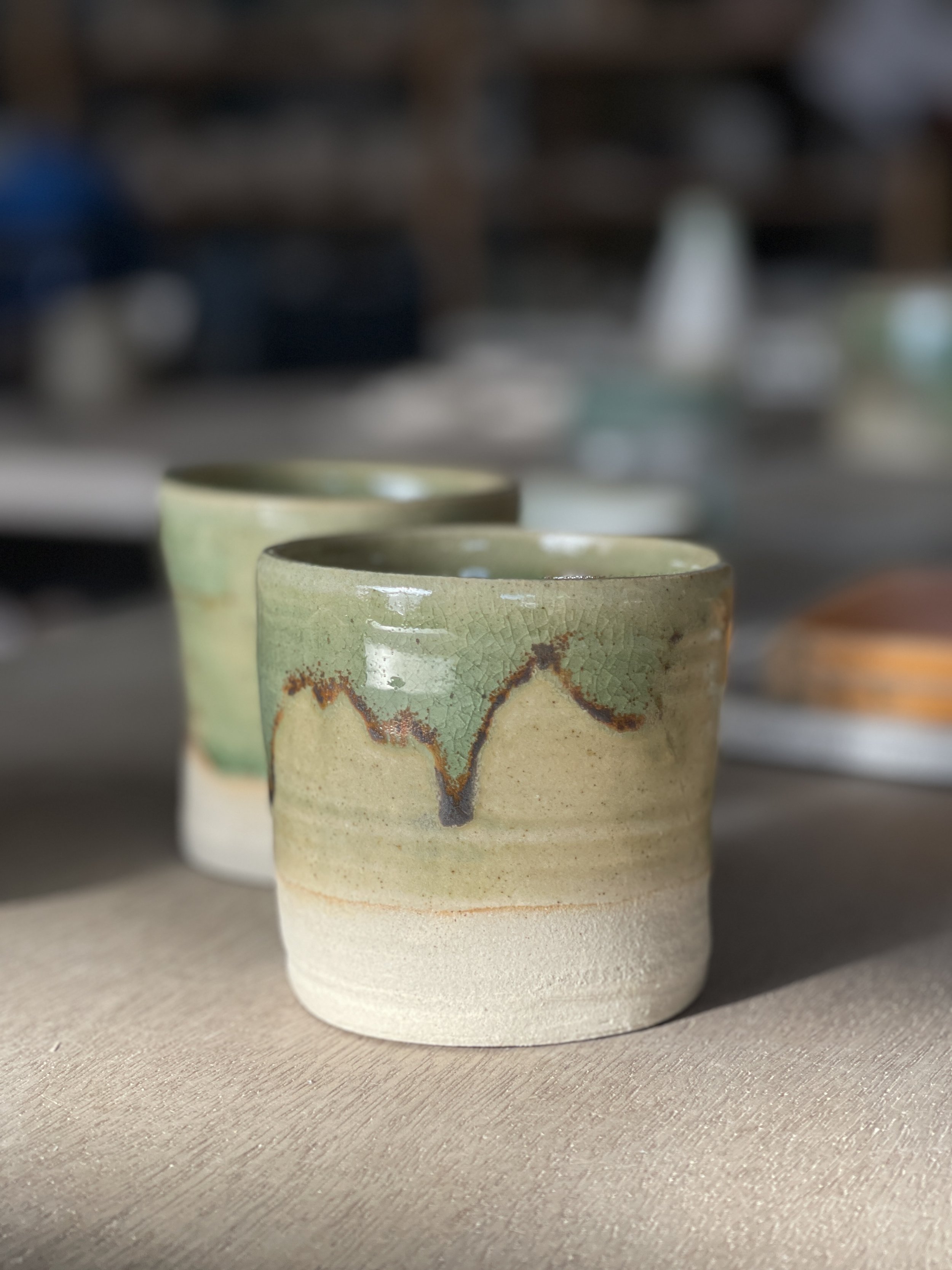
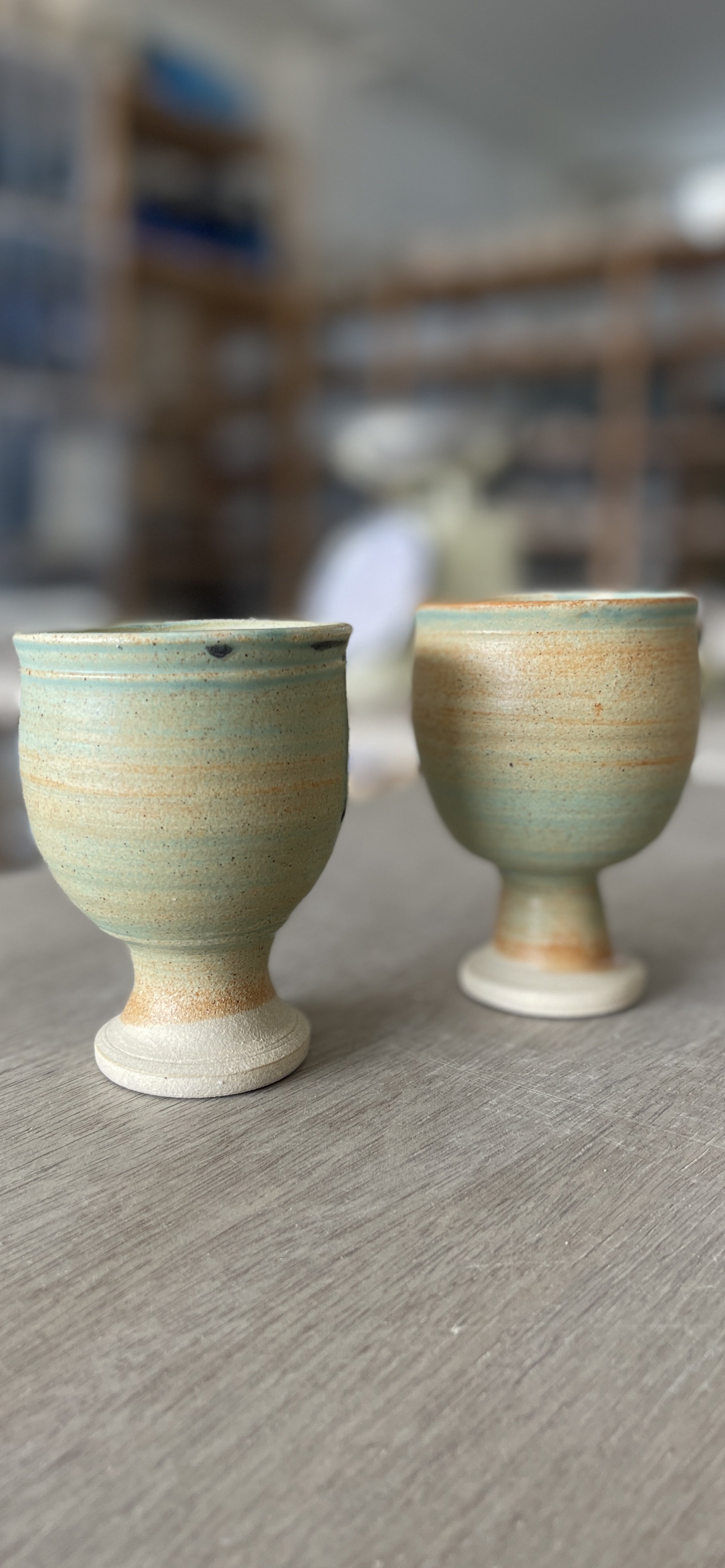
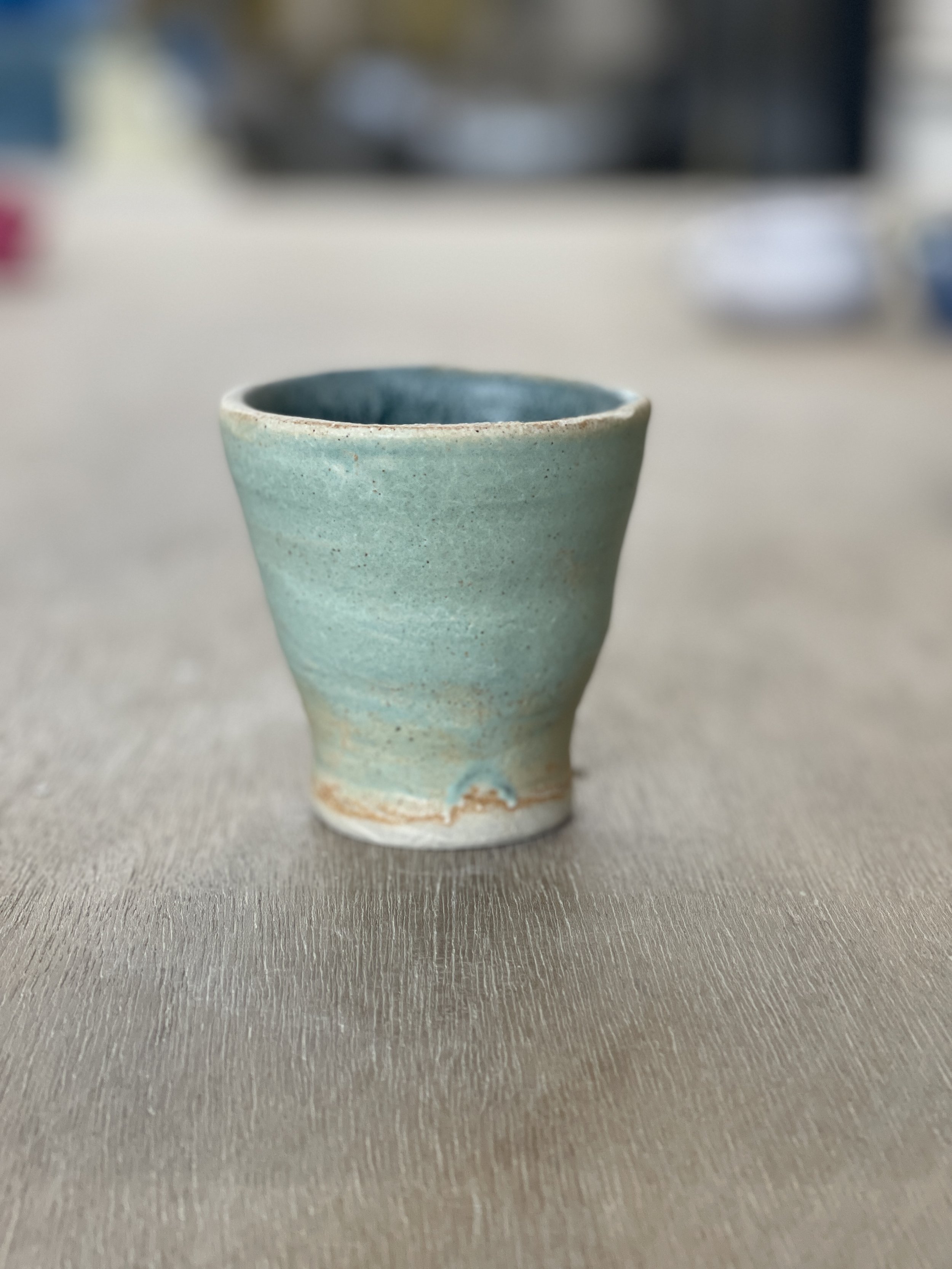
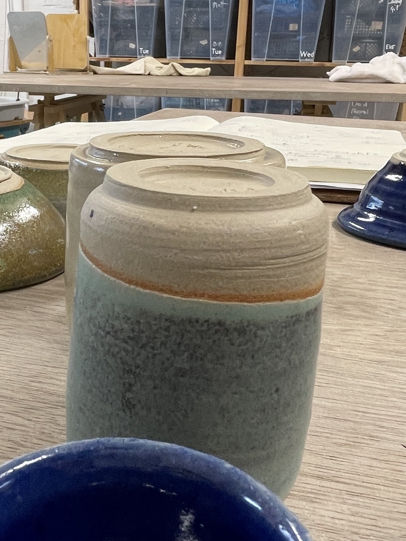
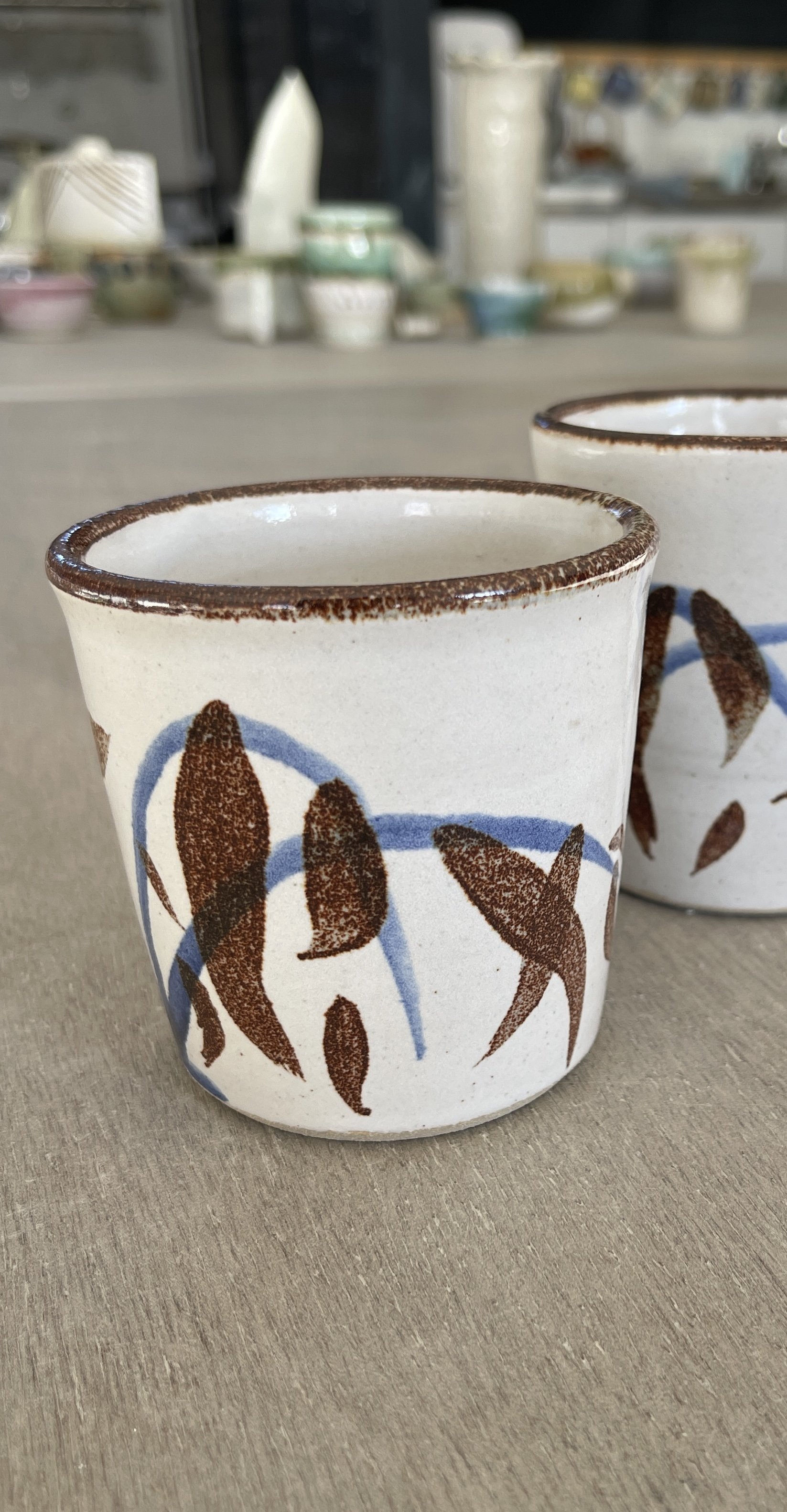
Cream and Celadon Green. A line of orange appears where it migrates with the clay.
Celadon Green falls on edges exposing some of the clay.
Copper Oxide on bisque under celadon green.
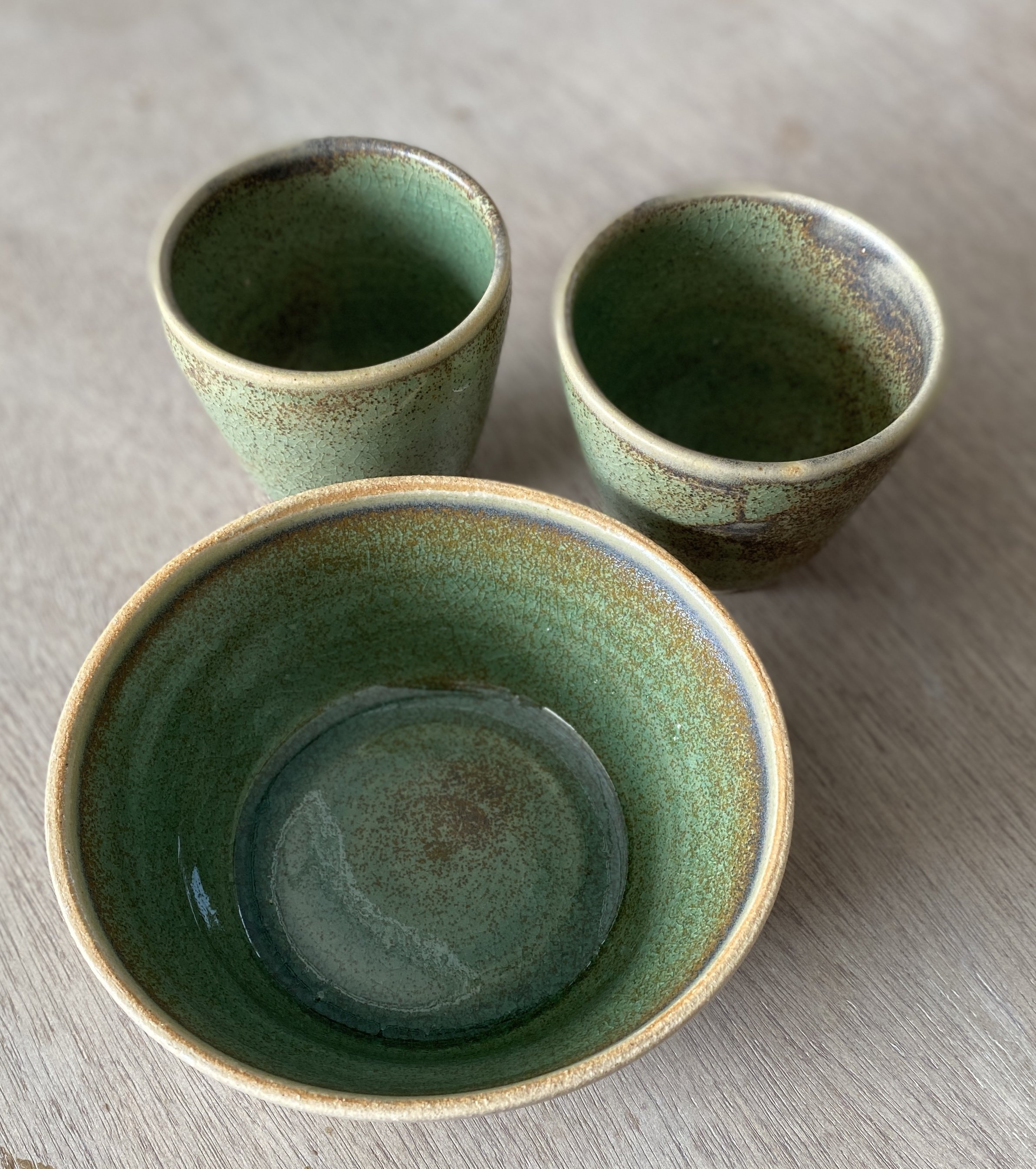
More pots in Celadon Green.
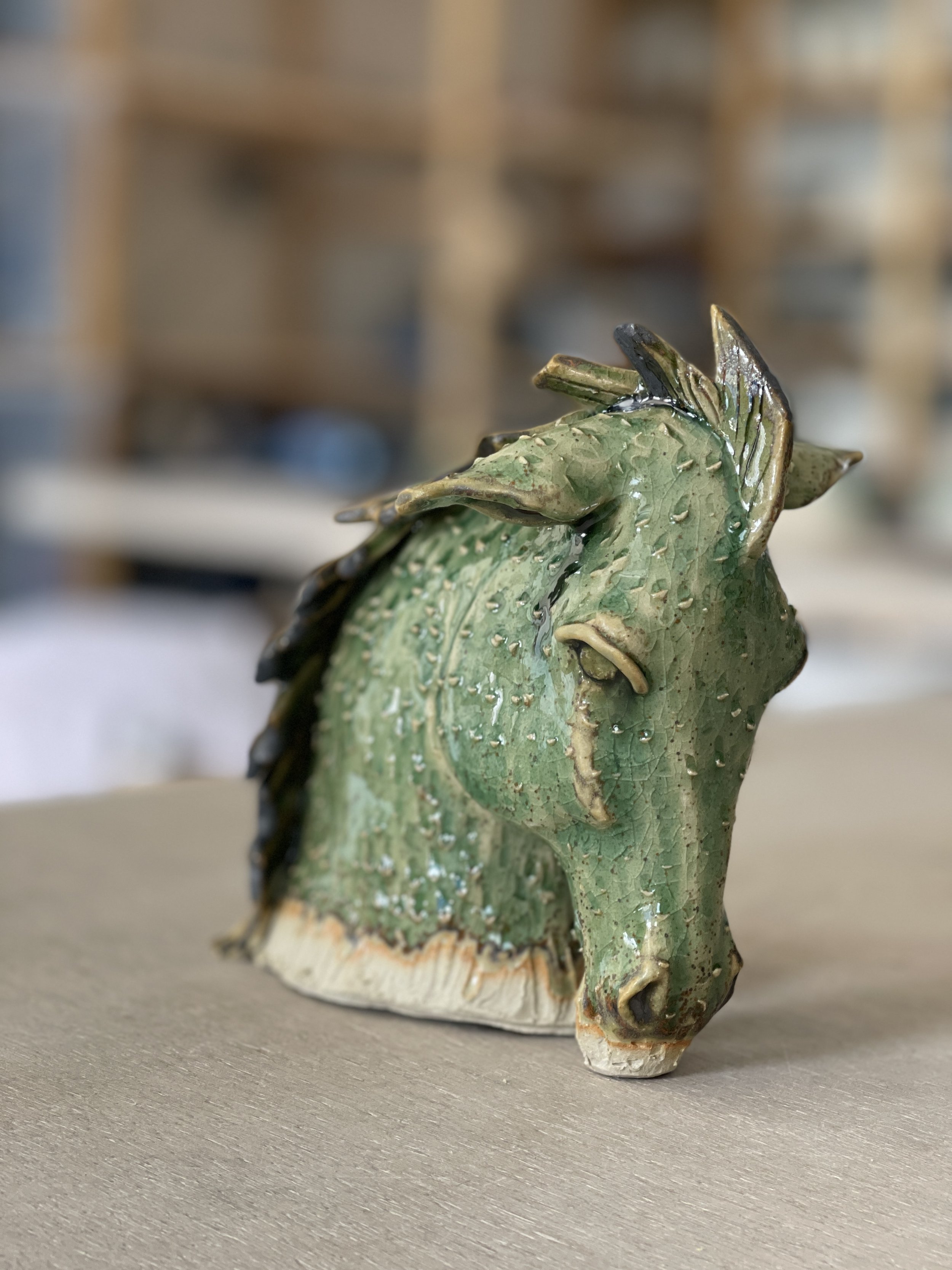
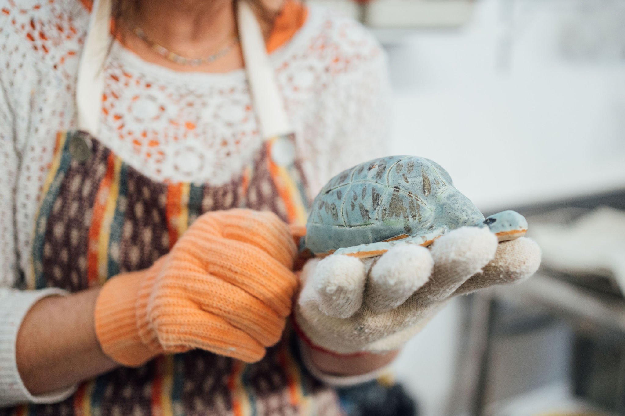
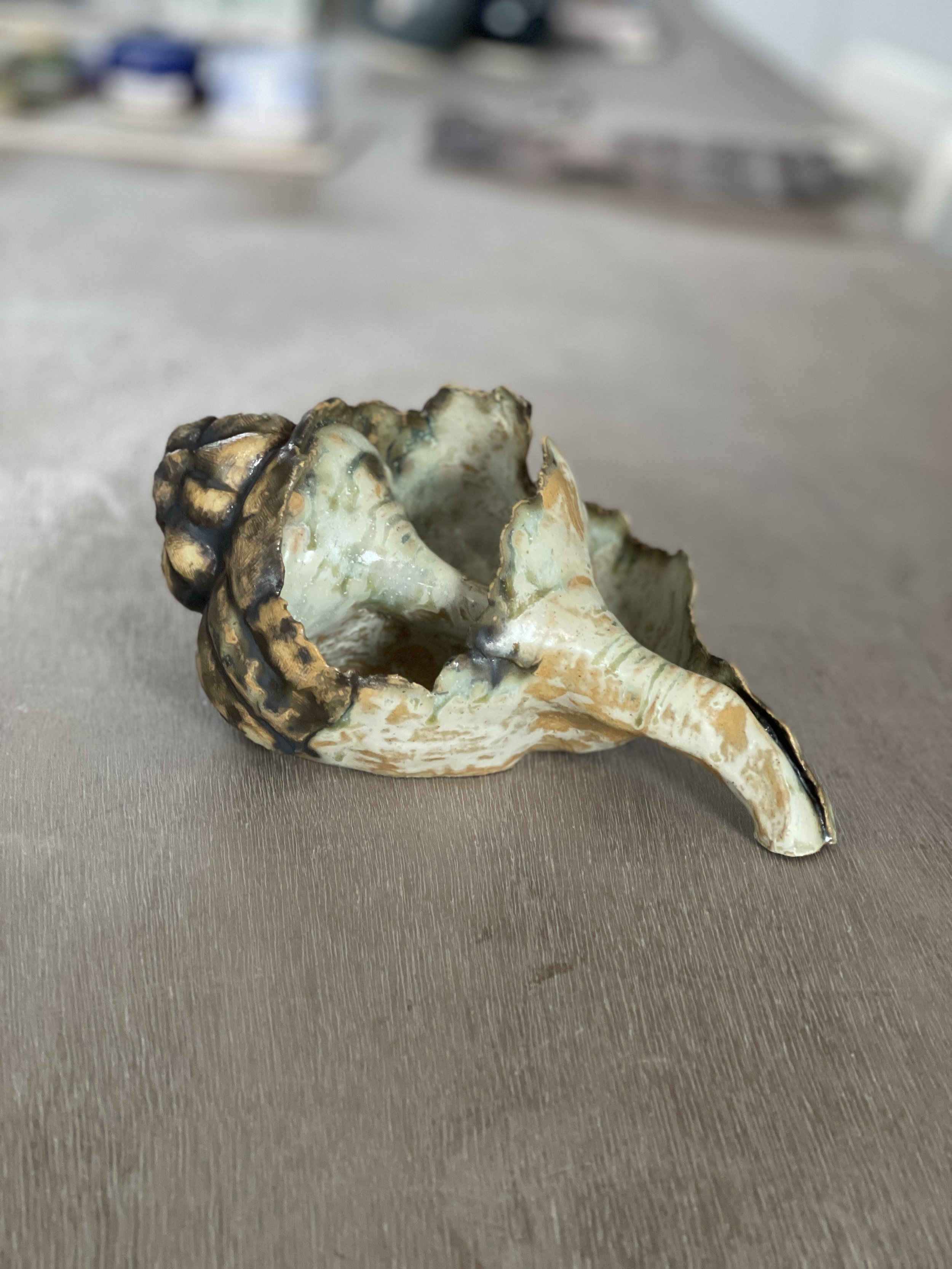
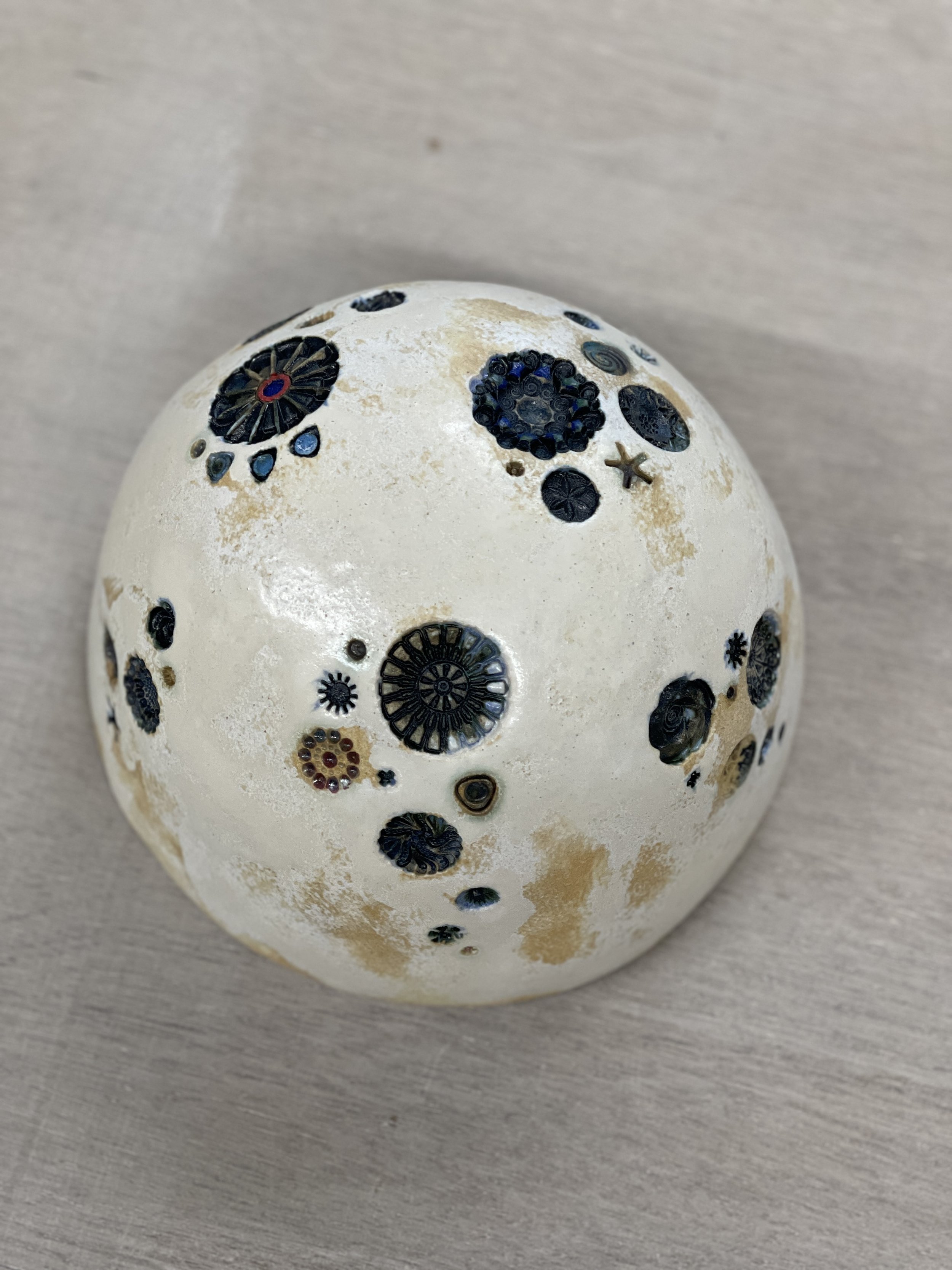
Look closely and you'll see the tones of copper patina in the carved insets of Diana's beautiful sculpture. A very quick dip wiped gently away on the edges.
Single dips of one glaze produce elegant results for Kezia. Well done.
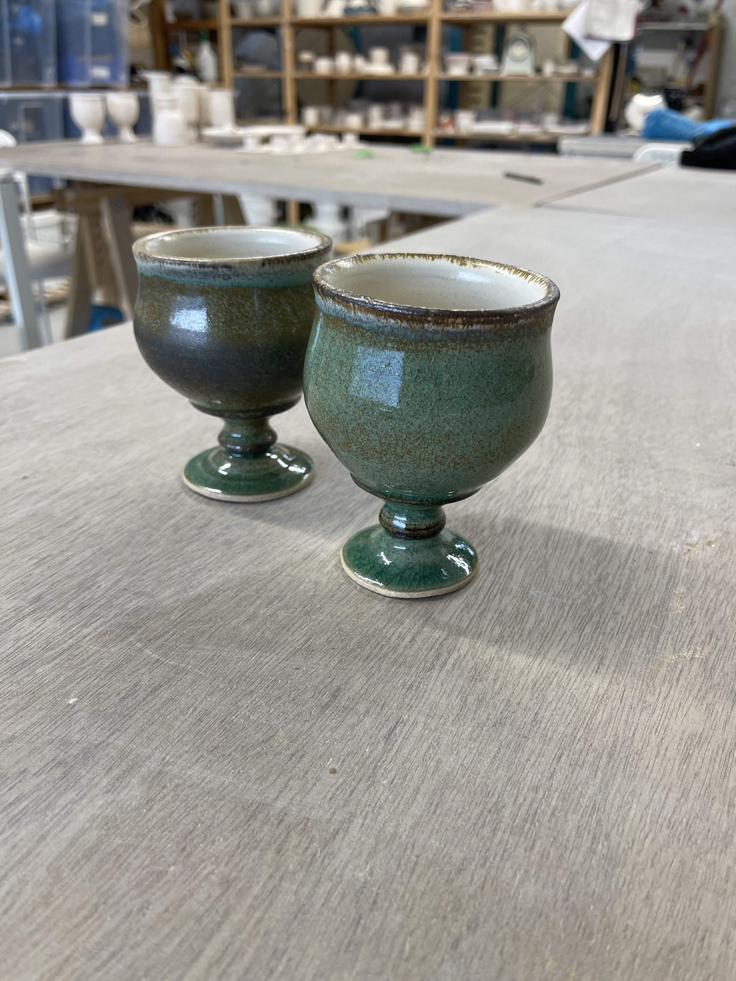
Goblets in a copper patina with transparent inside. Quick 1 second dip gives less coverage.
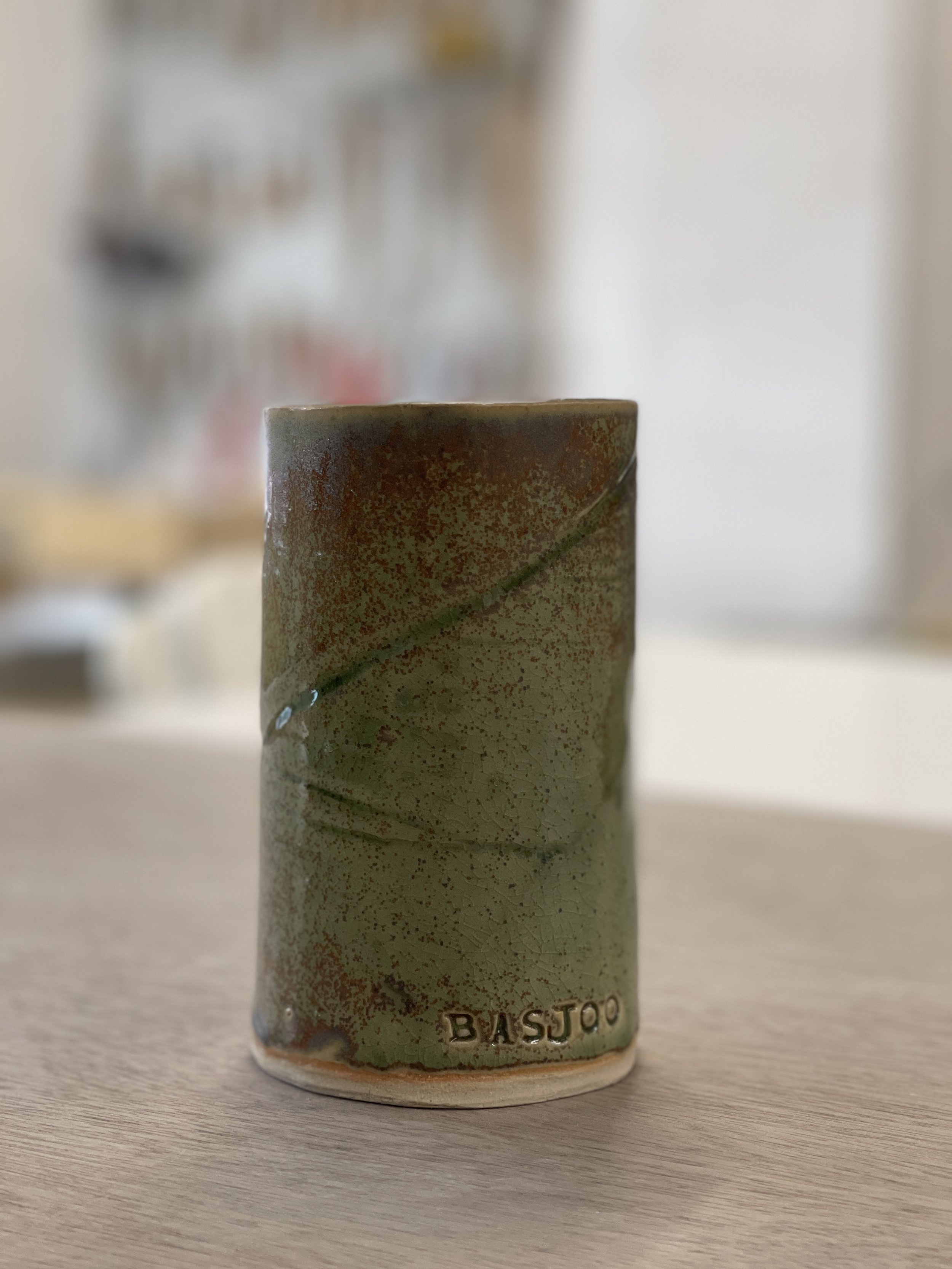
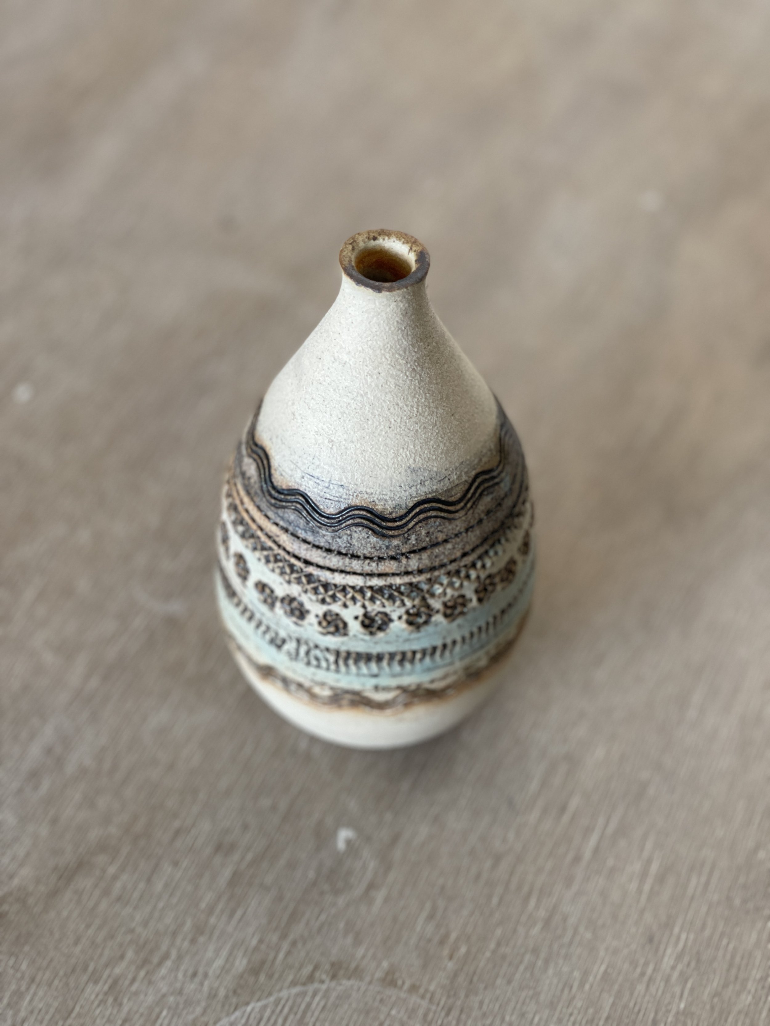
Good illustration of the orange line at the migration point of glaze with the iron in the clay.
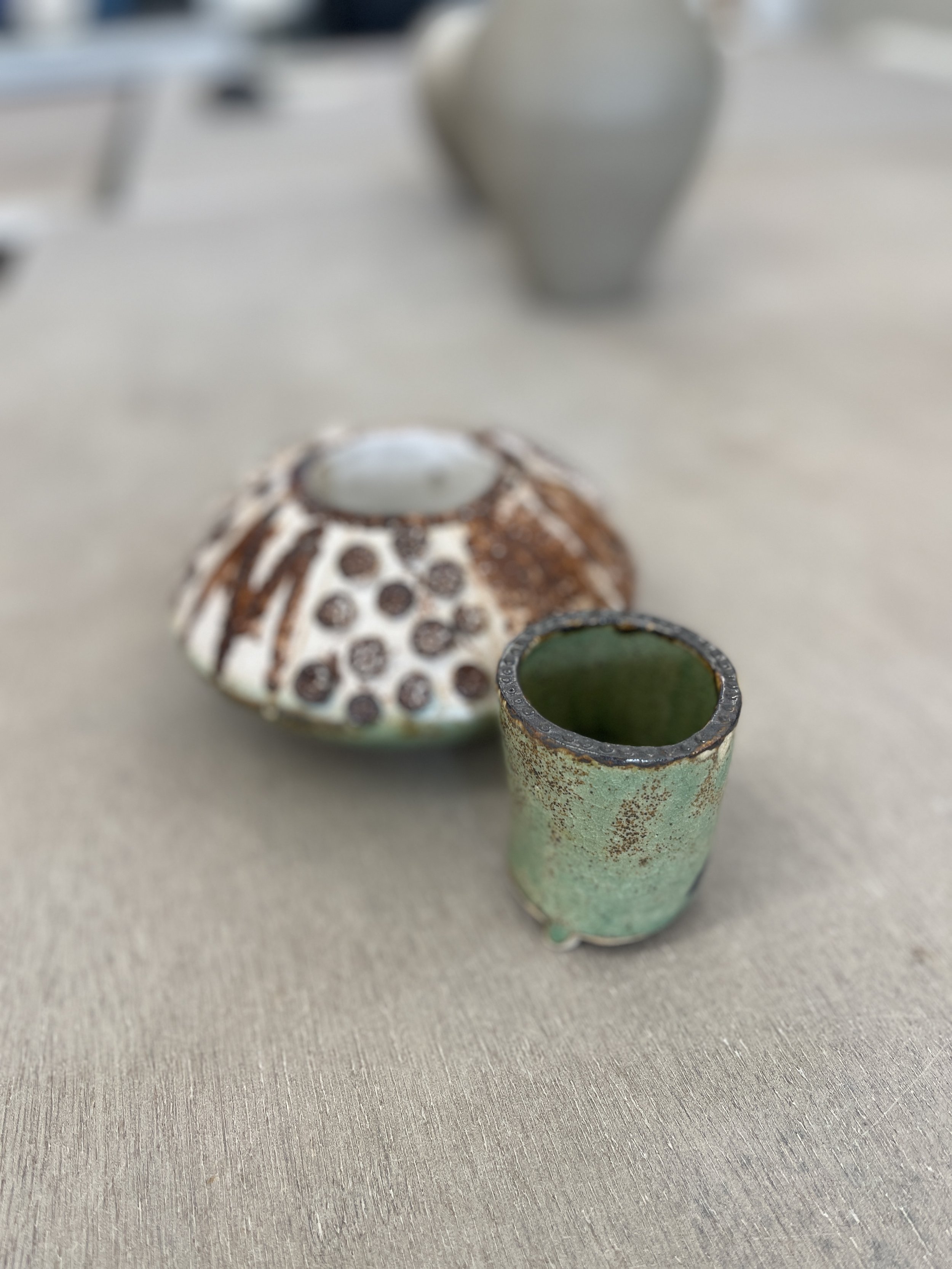
Funky use of unglazed and what looks like an aged copper interior.
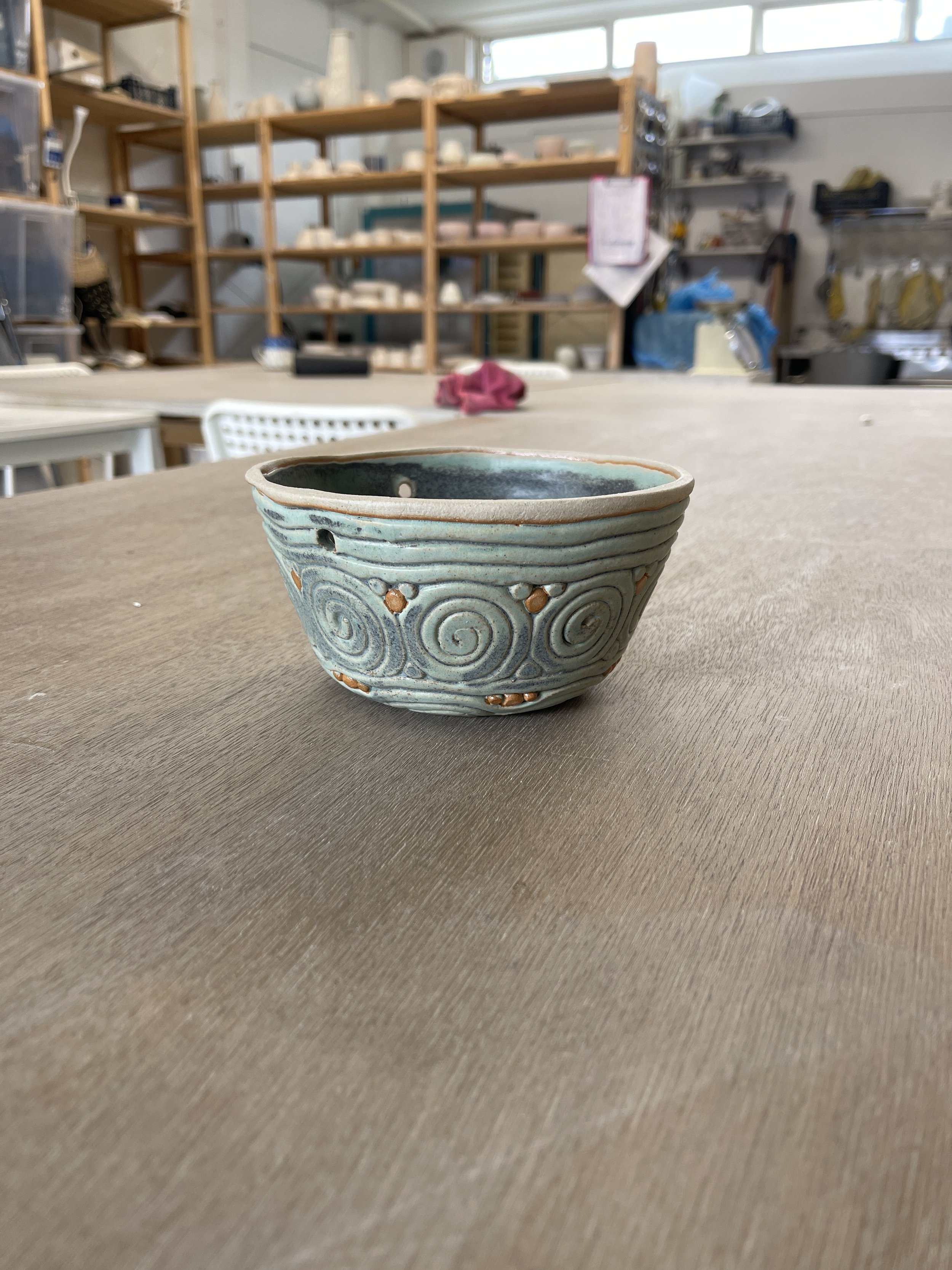
Very lovely coiled pot - use of wax resist dotted in places highlights the orange hue from the meeting of the glaze with the clay.
Copper Patina is not a stable glaze - avoid using on surfaces in contact with food.
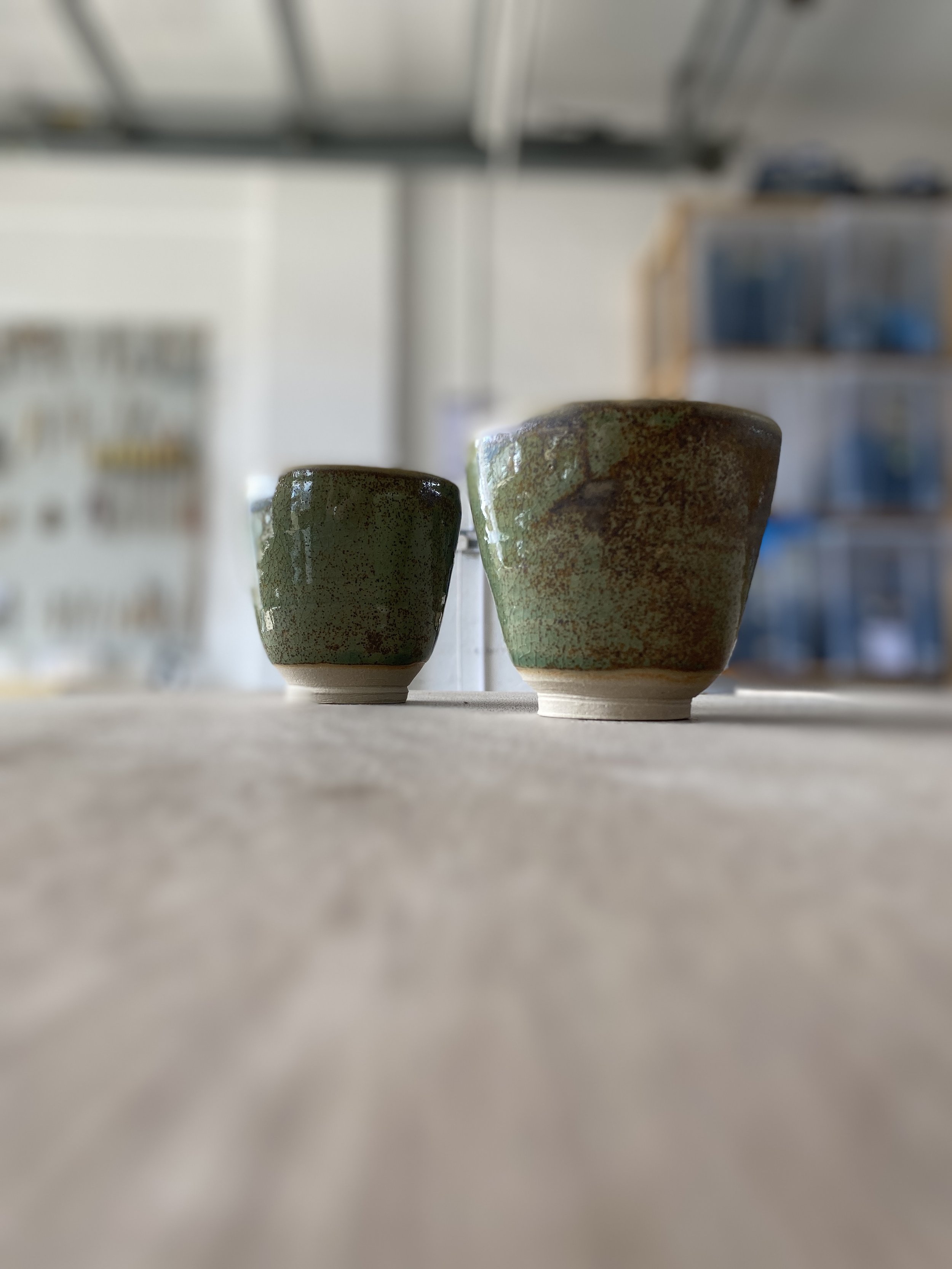
Patina is a bit random - can appear where the glaze is thicker but difficult to predict.
Quicker dip gives lighter tone. Orange hue is pleasant in contrast.
Orange tone where glaze migrates on surface of clay.
Transparent inside when used with food is a nice glossy contrast.
Texture enhanced with black iron oxide works well.
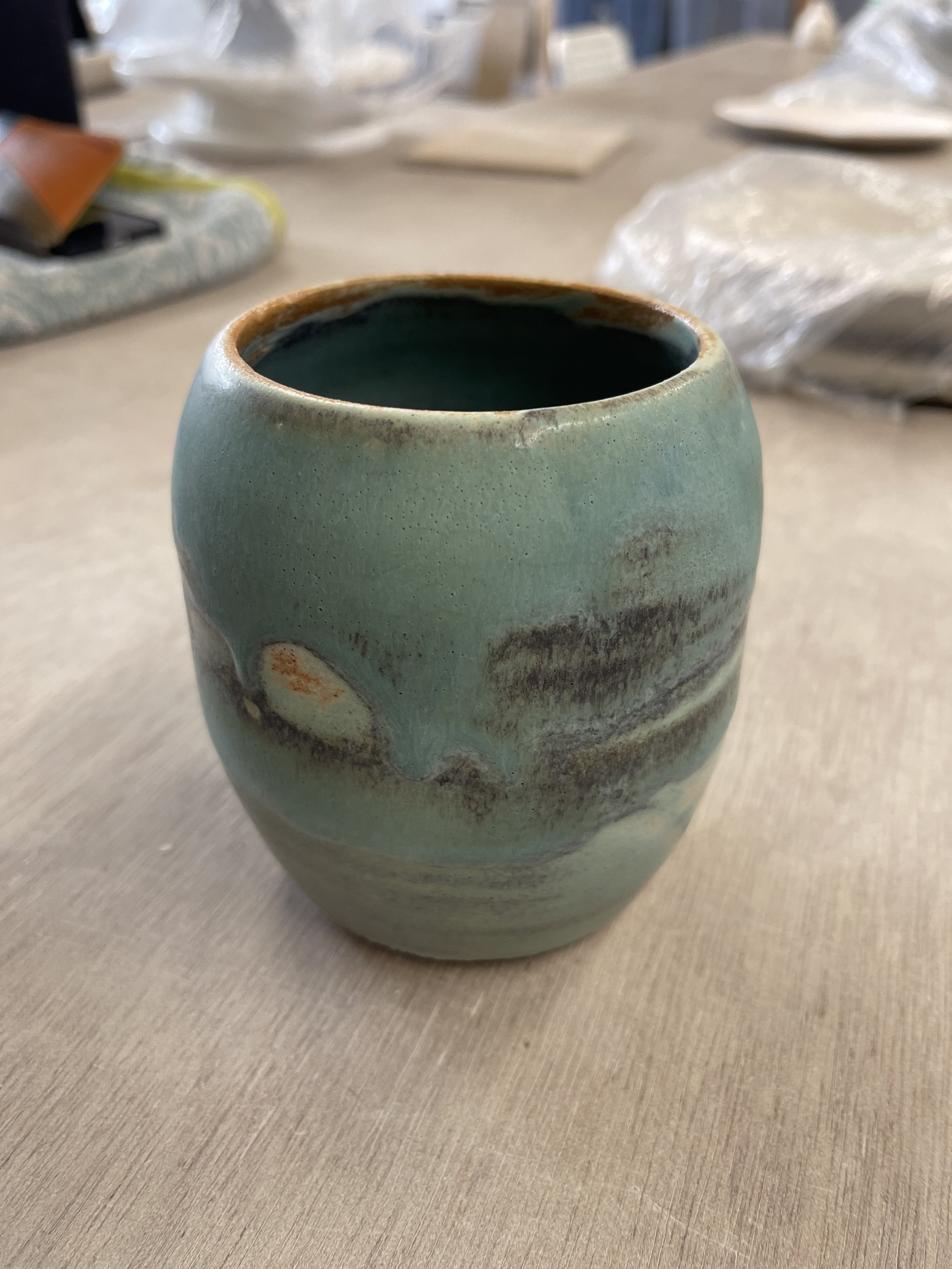
Copper Patina is a matt glaze - opaque and a lovely green/blue.
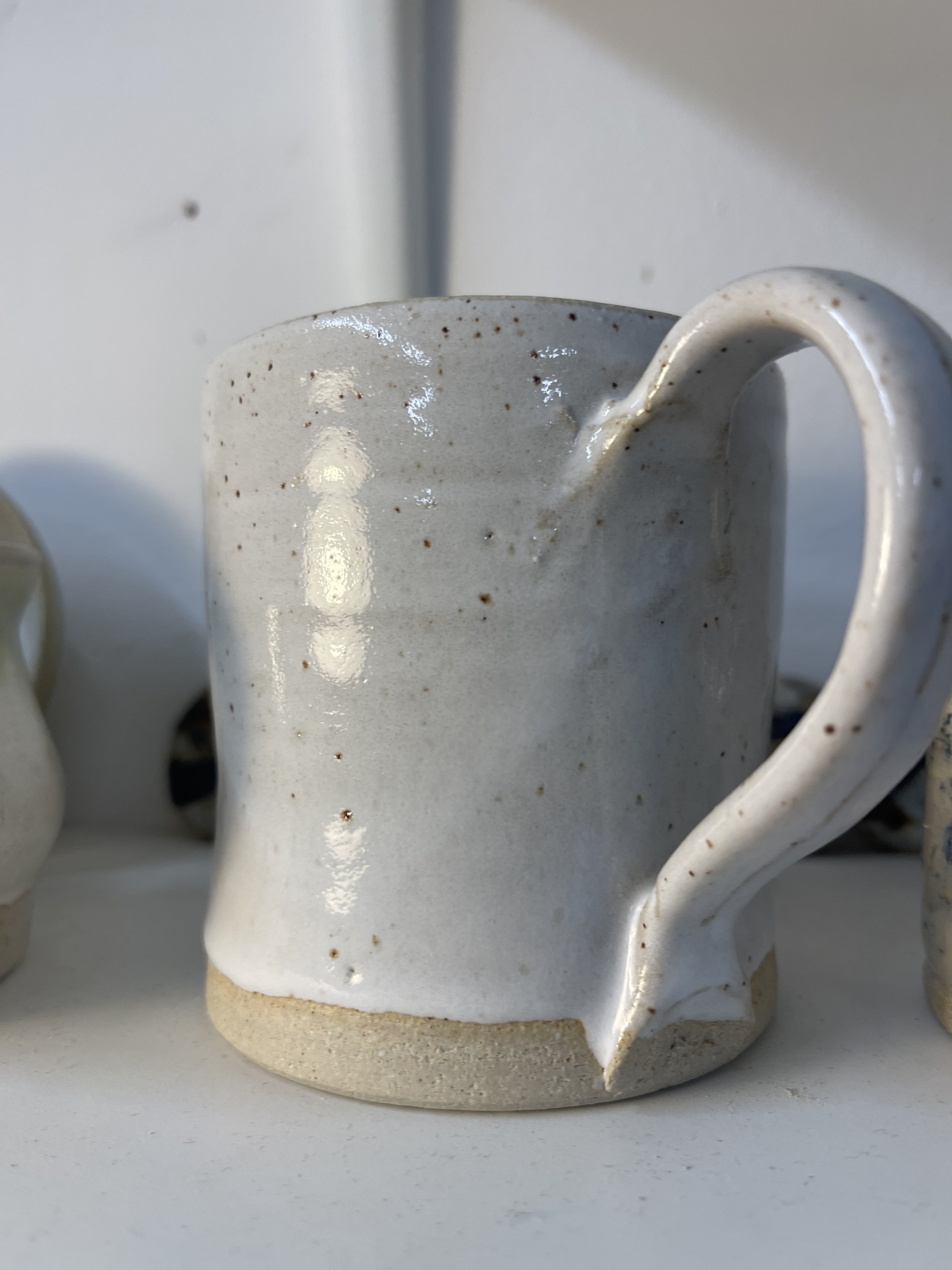
Mug with transparent inside.
A very beautiful pot brushed with a very light coating of copper patina and a blend of manganese, black and red iron oxides.
This is an example of leaching. The using matt glazes it is sensible to test with a half-lemon overnight. The white indicates there's been some chemistry with the copper oxide and the acid in the food. Use a transparent on the inside surfaces in contact with food.
An exceptionally skilful sculpture layered with all sorts of tones over the almond white.
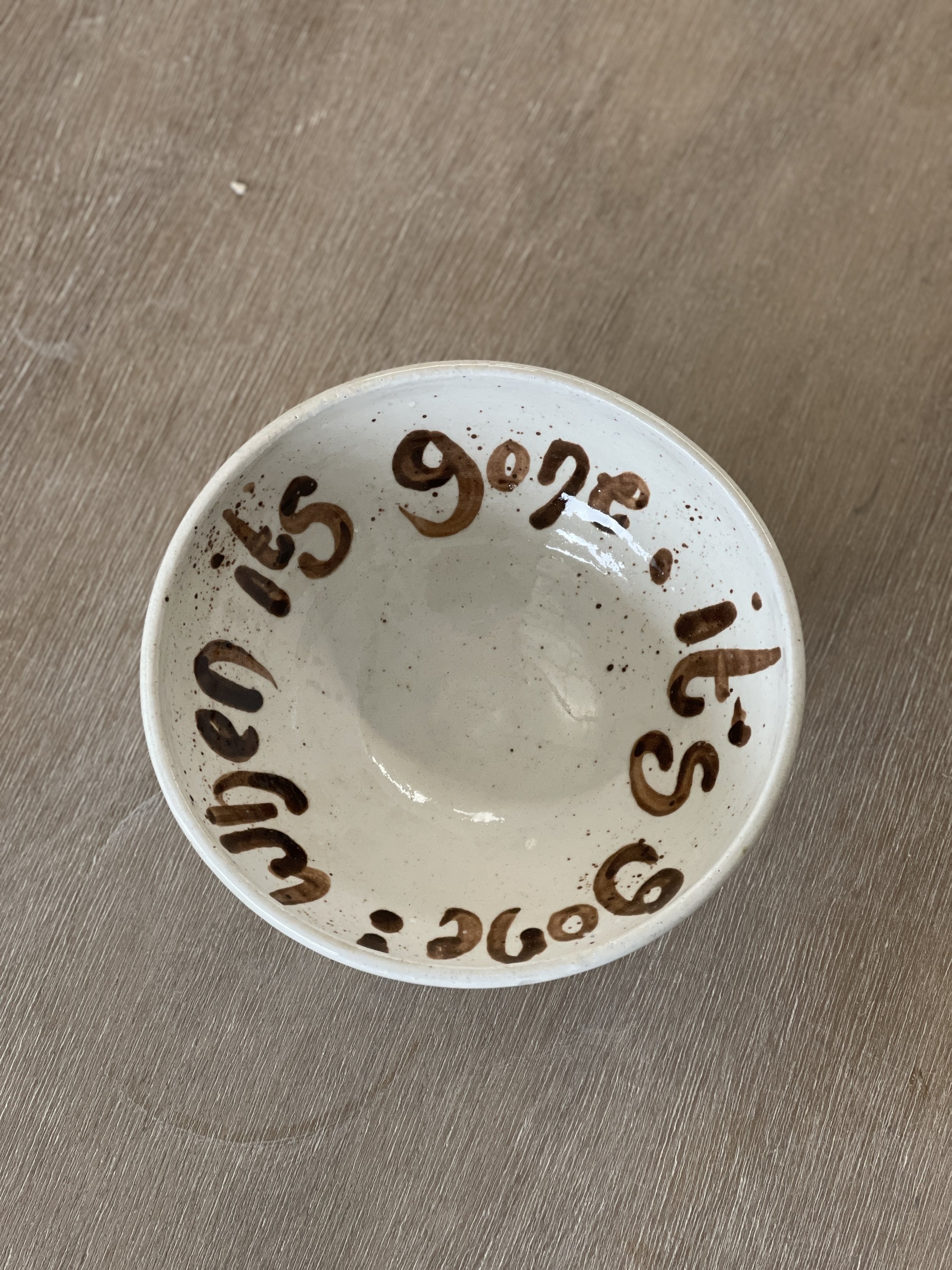
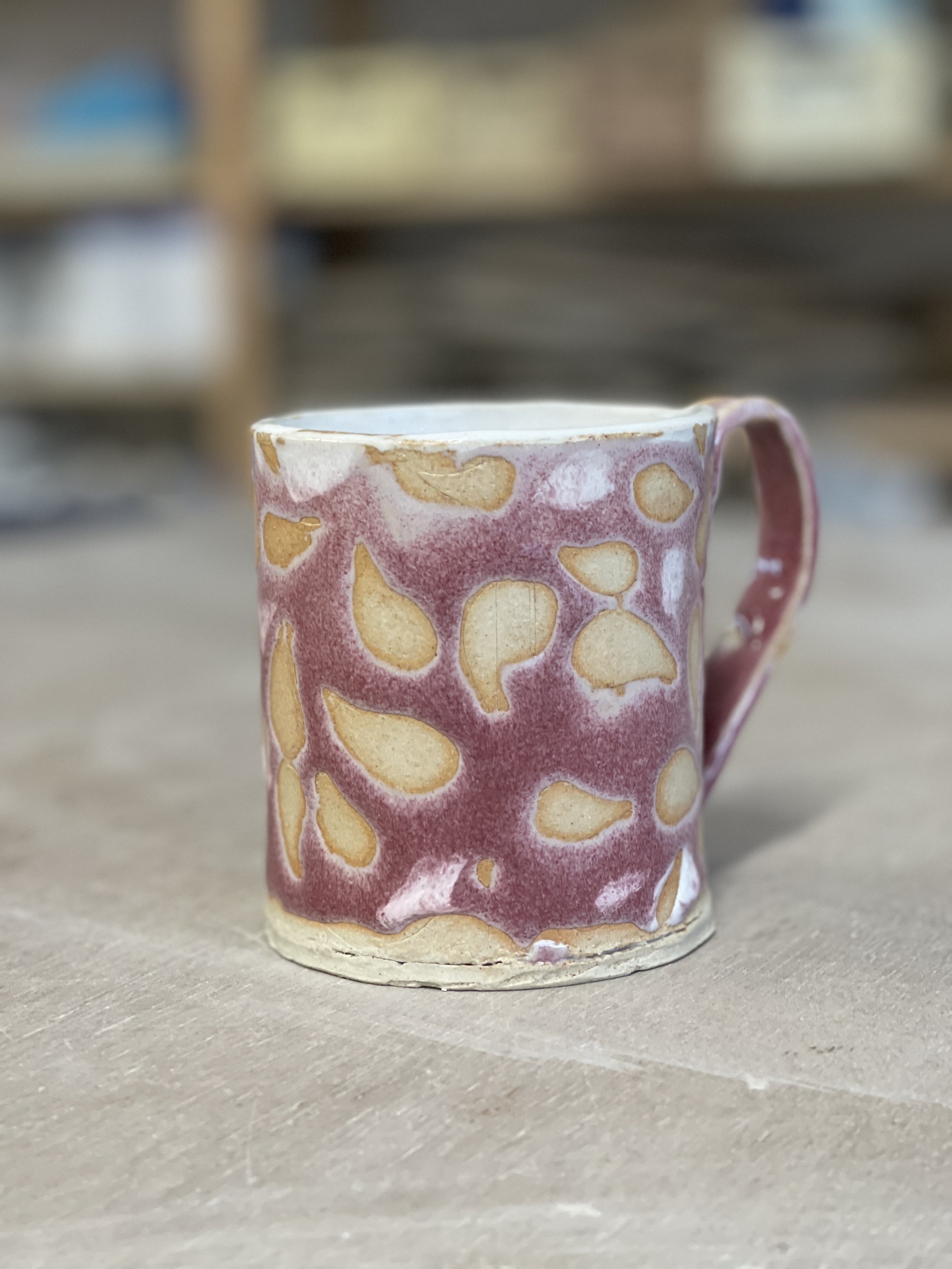
Very funky use of red iron oxide beautifully lettered on white. Very lovely indeed.
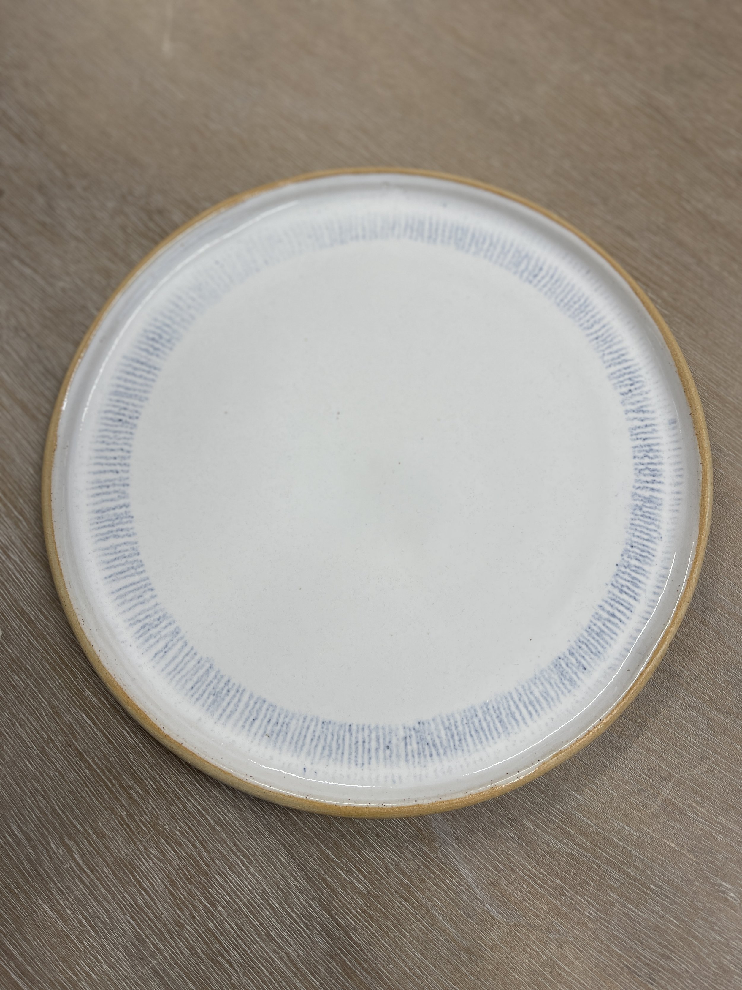
Glossy White plate with oxide pencil lines
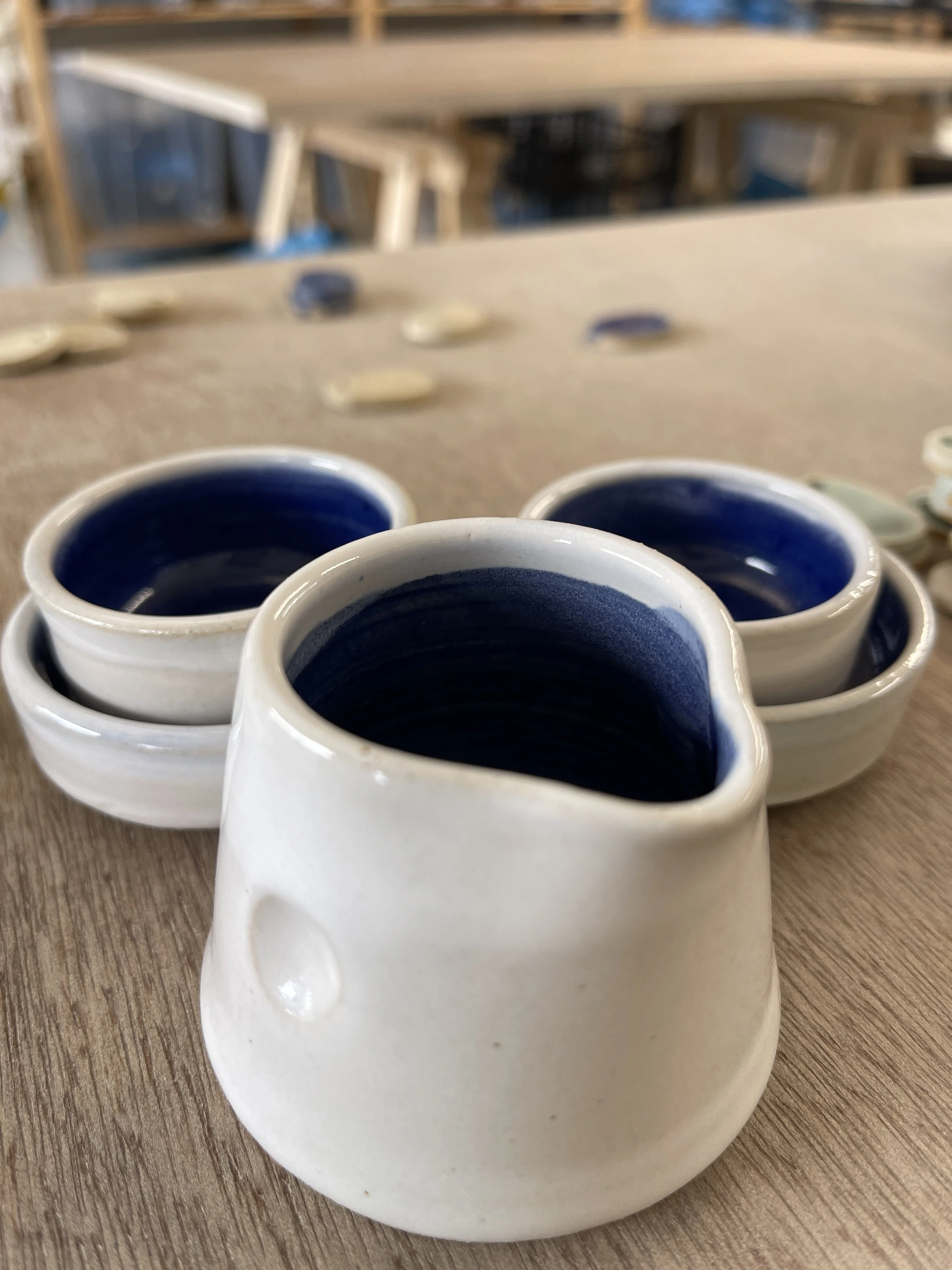
Glossy white with blue interior

White falls nicely to accentuate edges.
Brown oxide paint marks with cobalt under glossy white.
Quick dip allows speckles of iron in the clay to appear.
Edges often have a brown/orange hue to them.
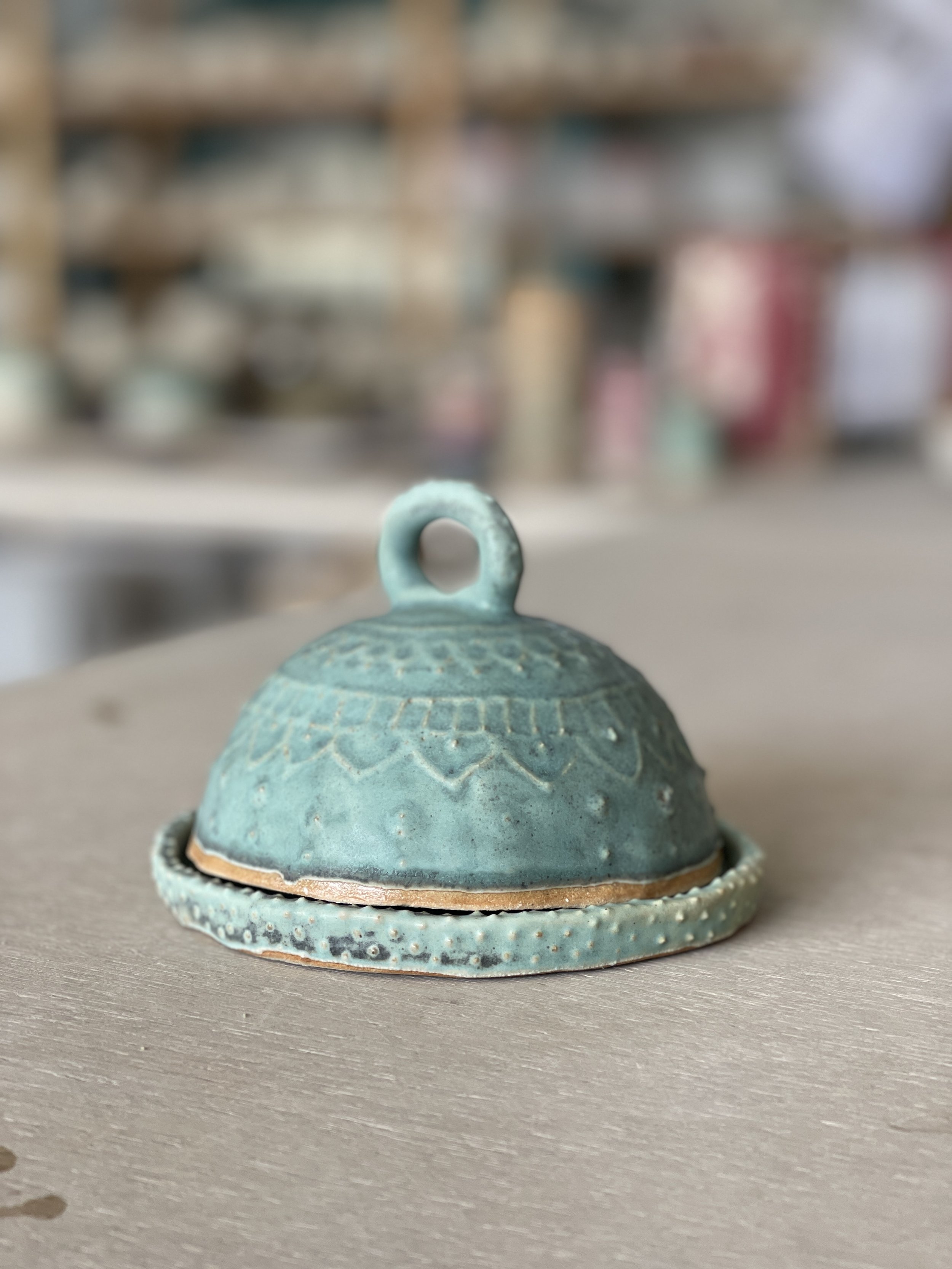
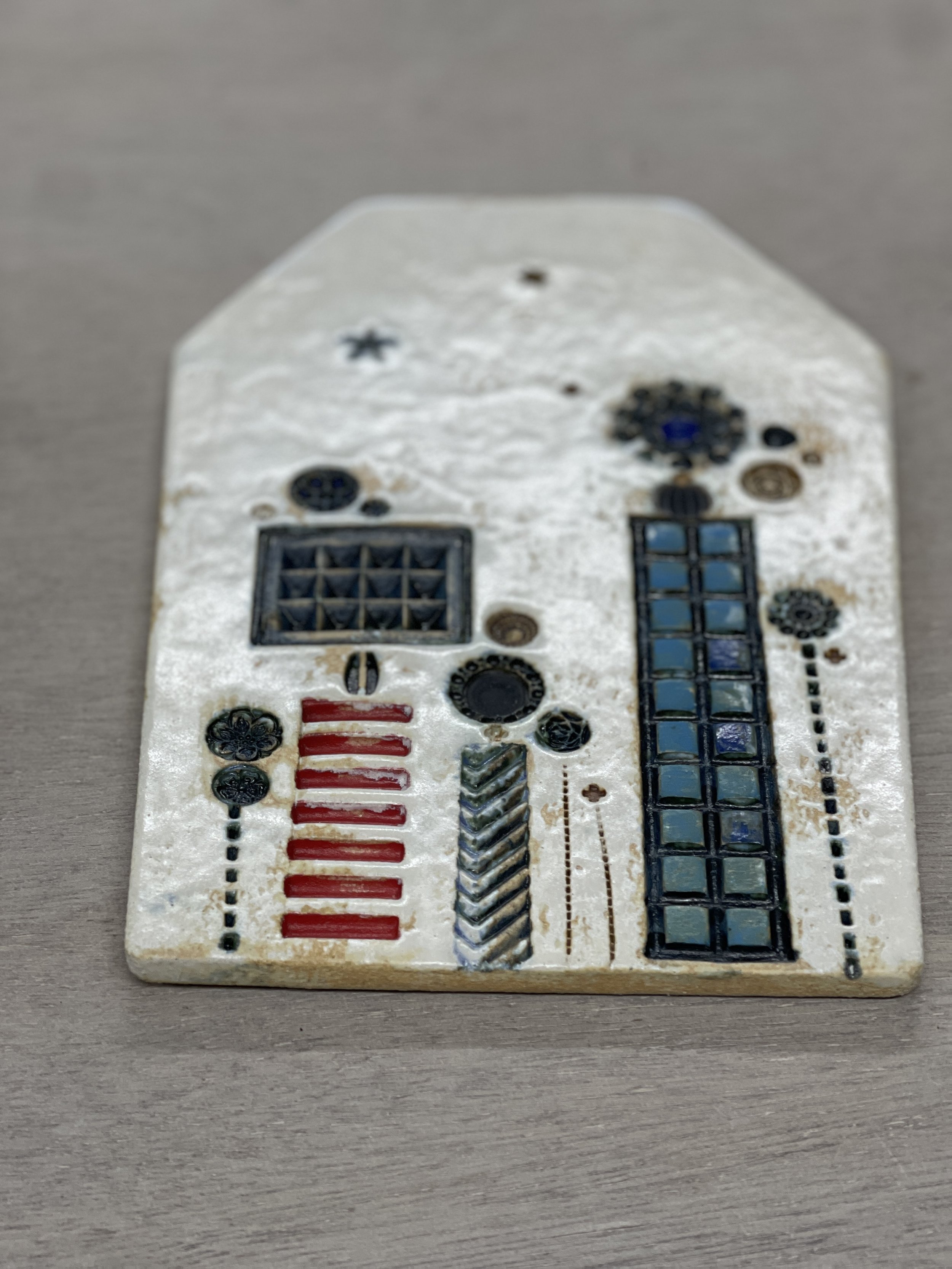
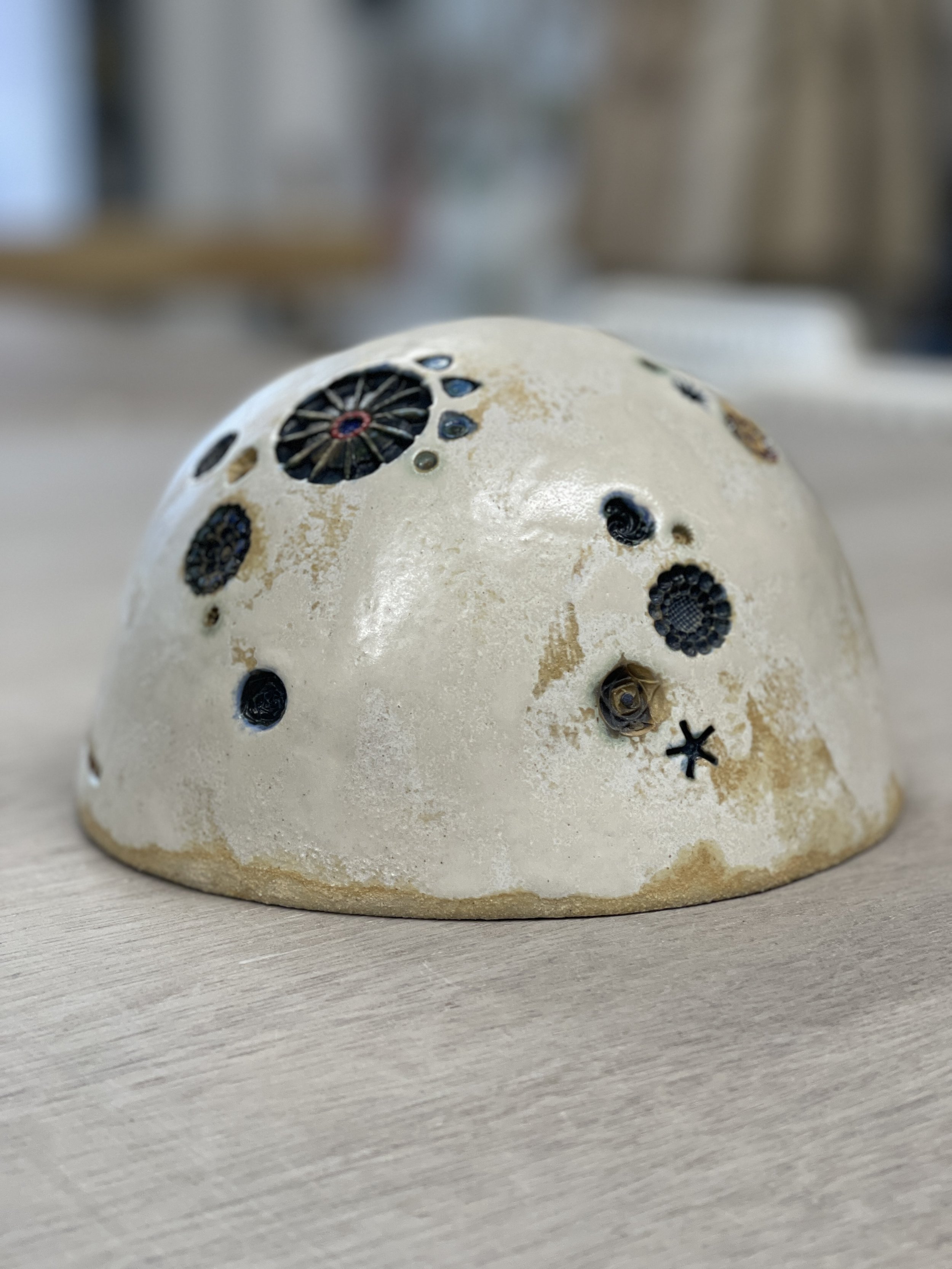
Helen works wonders with stamps, oxides and a touch of underglaze. This dome is Almond White.
Matt has lined the rim and sides of handles with a combination of cobalt and copper oxide on top of Almond White.

Cian's work includes flecks of cobalt oxide on top of Fjord blue. Very lovely.
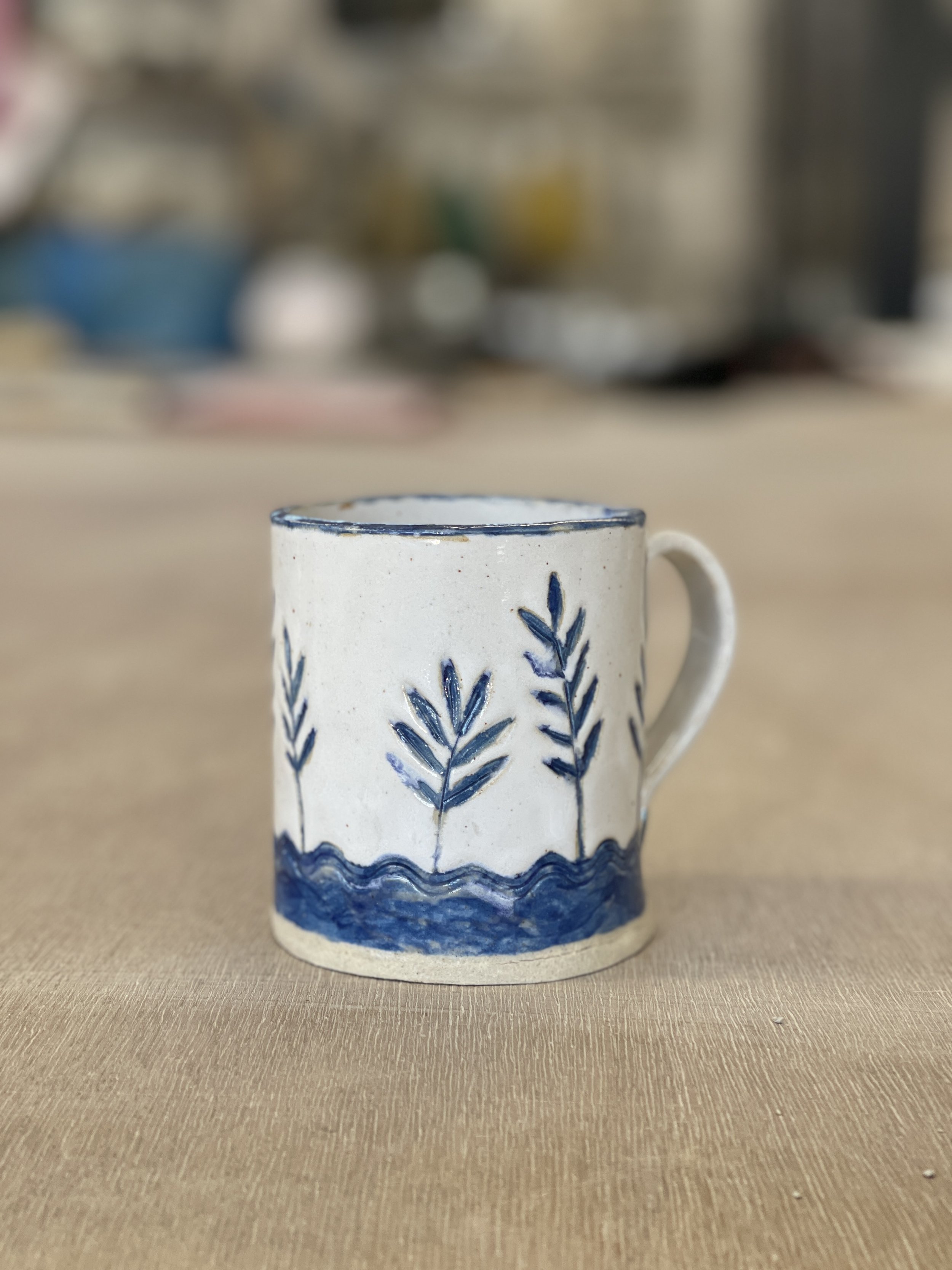
Quite complex layering to conserve the blue glaze over the white. Dipping, wax and painting techniques used to make this beautiful slab-built finished mug.
Cobalt Blue Glossy with White
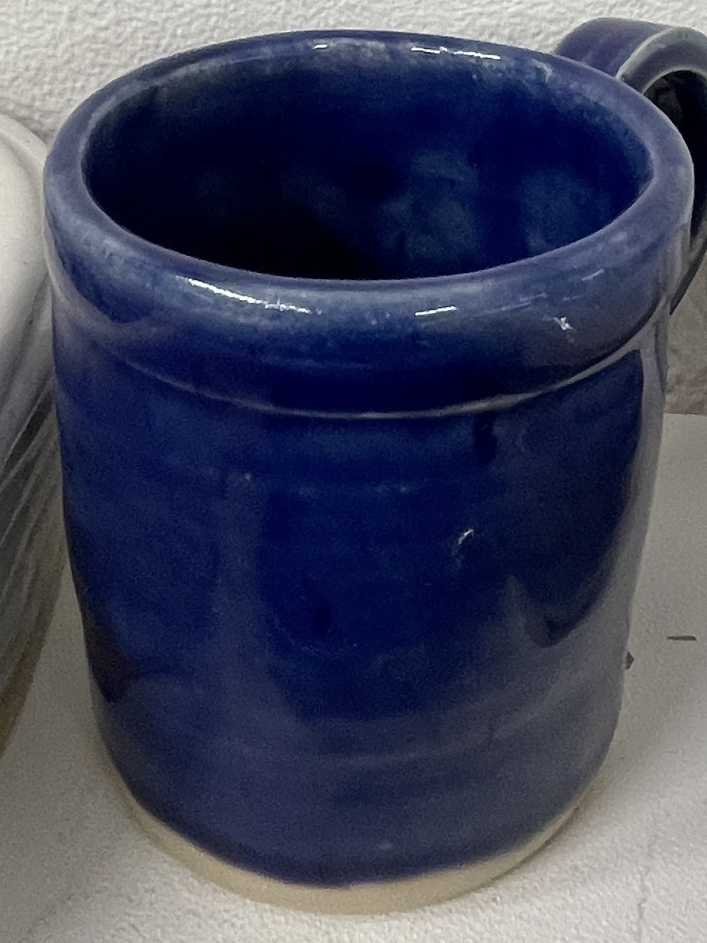
Cobalt Blue over stoneware clay
Glossy White with rim of cobalt blue
Cobalt Blue accentuates the texture.
Very drippy - keep well away from the kiln shelf
Reliably glossy
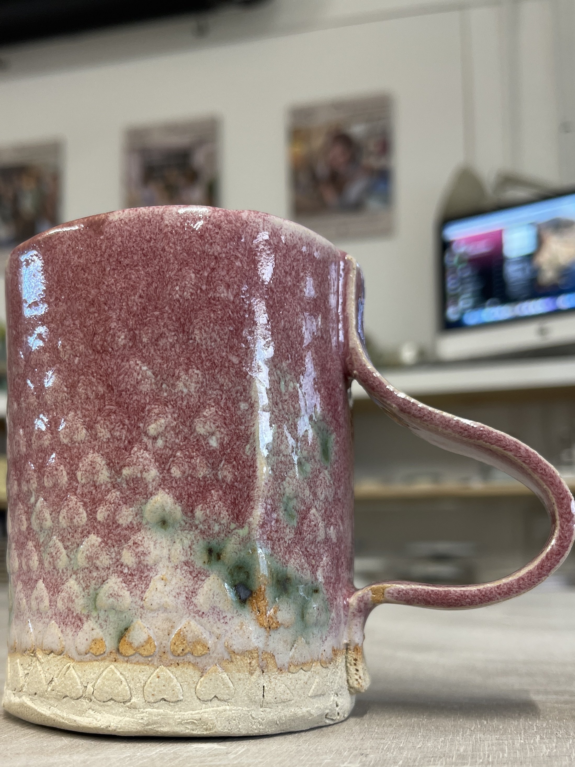
Rich and deep in colour

Jilly's Fjord Blue coiled pot in mould. Glaze has been scraped away to give an inlaid stripy effect.
Very lovely glazing by Dee here - everything has aligned to work well - temperature, overlap, layering. Well done.
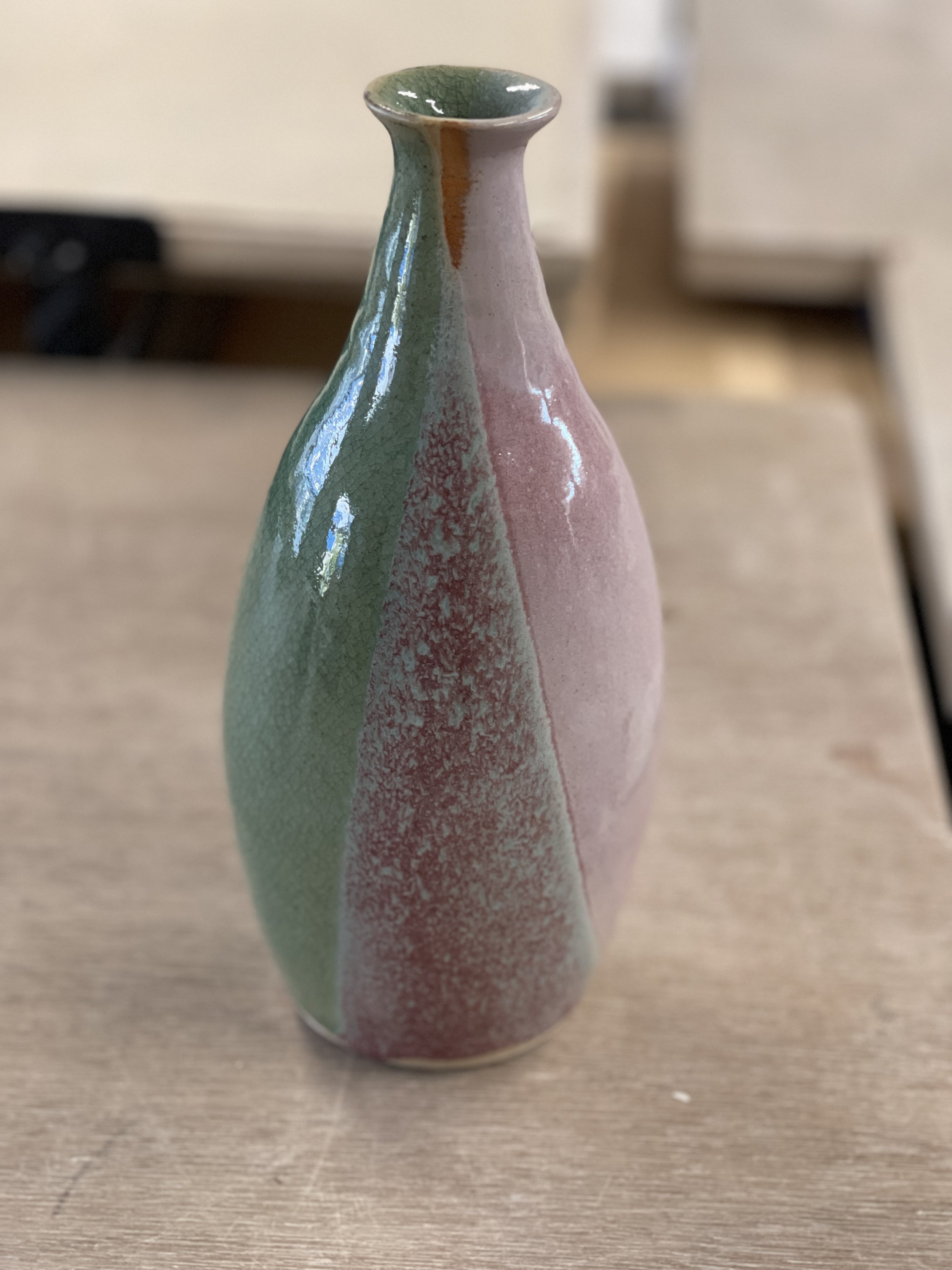
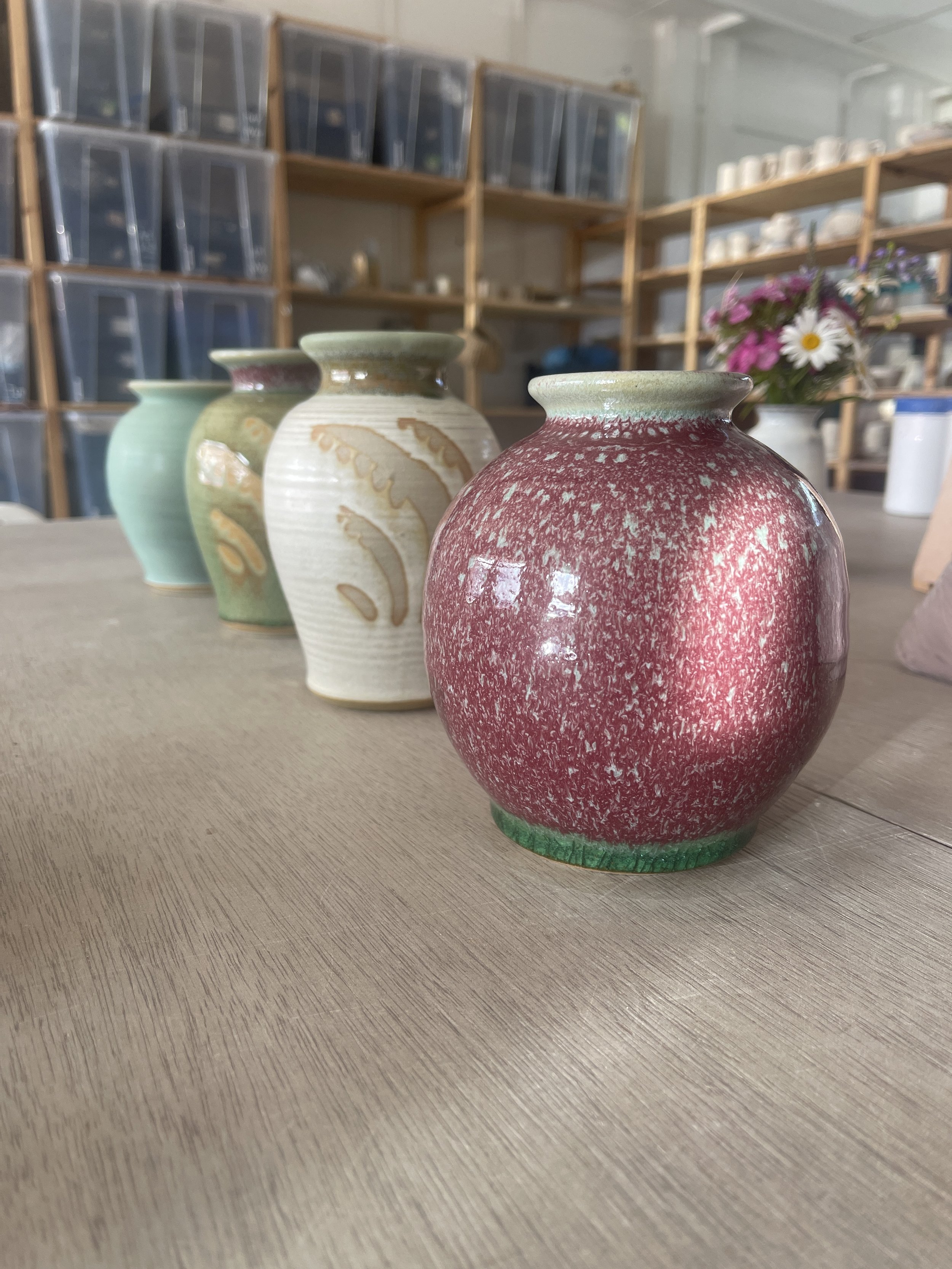
These illustrate the impact of sequence. Pink first then celadon green (at rear) and vice versa (front).
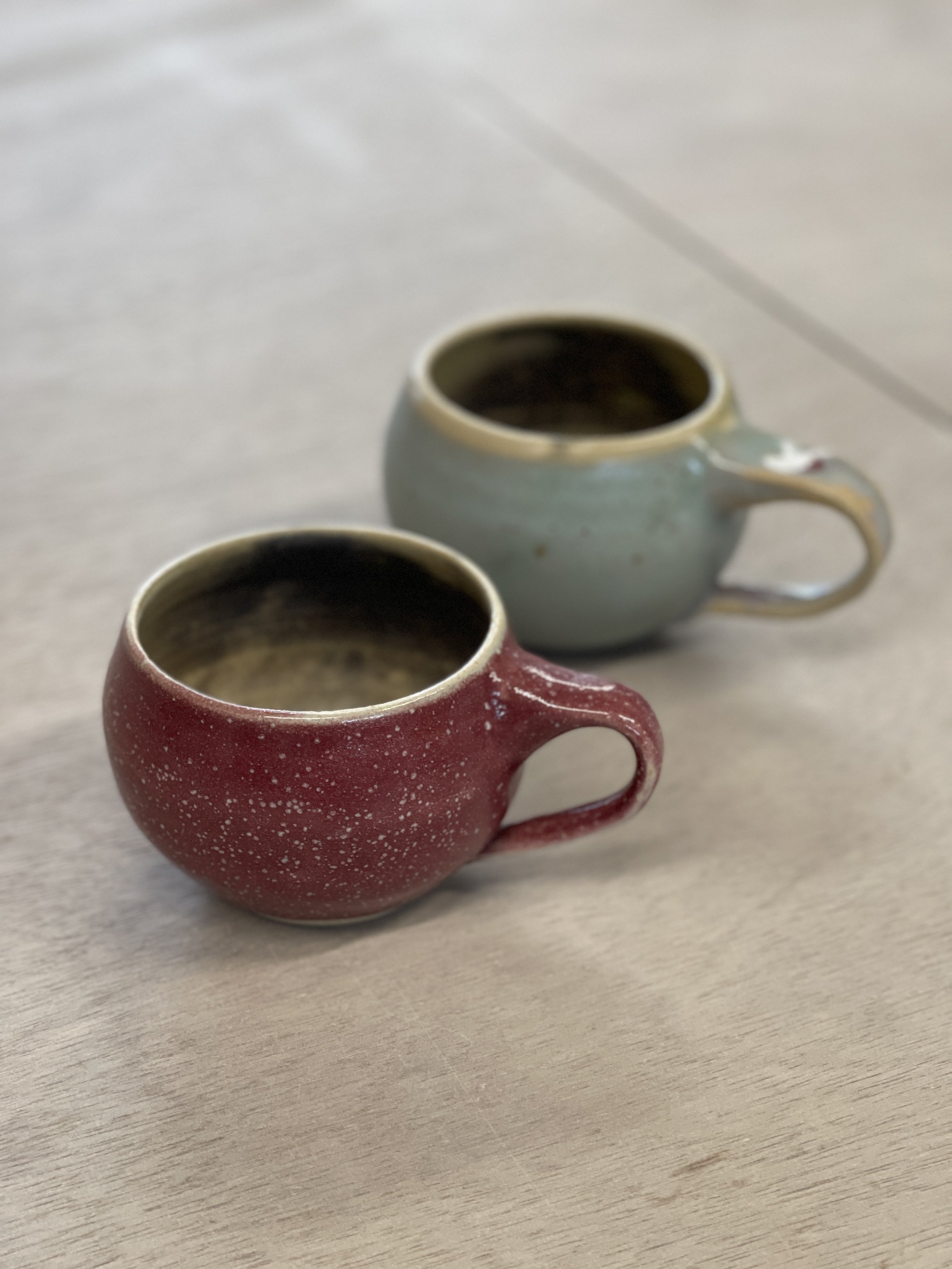
Amaryllis pink offers a contrast with glossy black.

Look closely to see waves of glaze - amaryllis pink will give you different tones depending on thickness.
Clever use of dipping to give the impression of stripes.
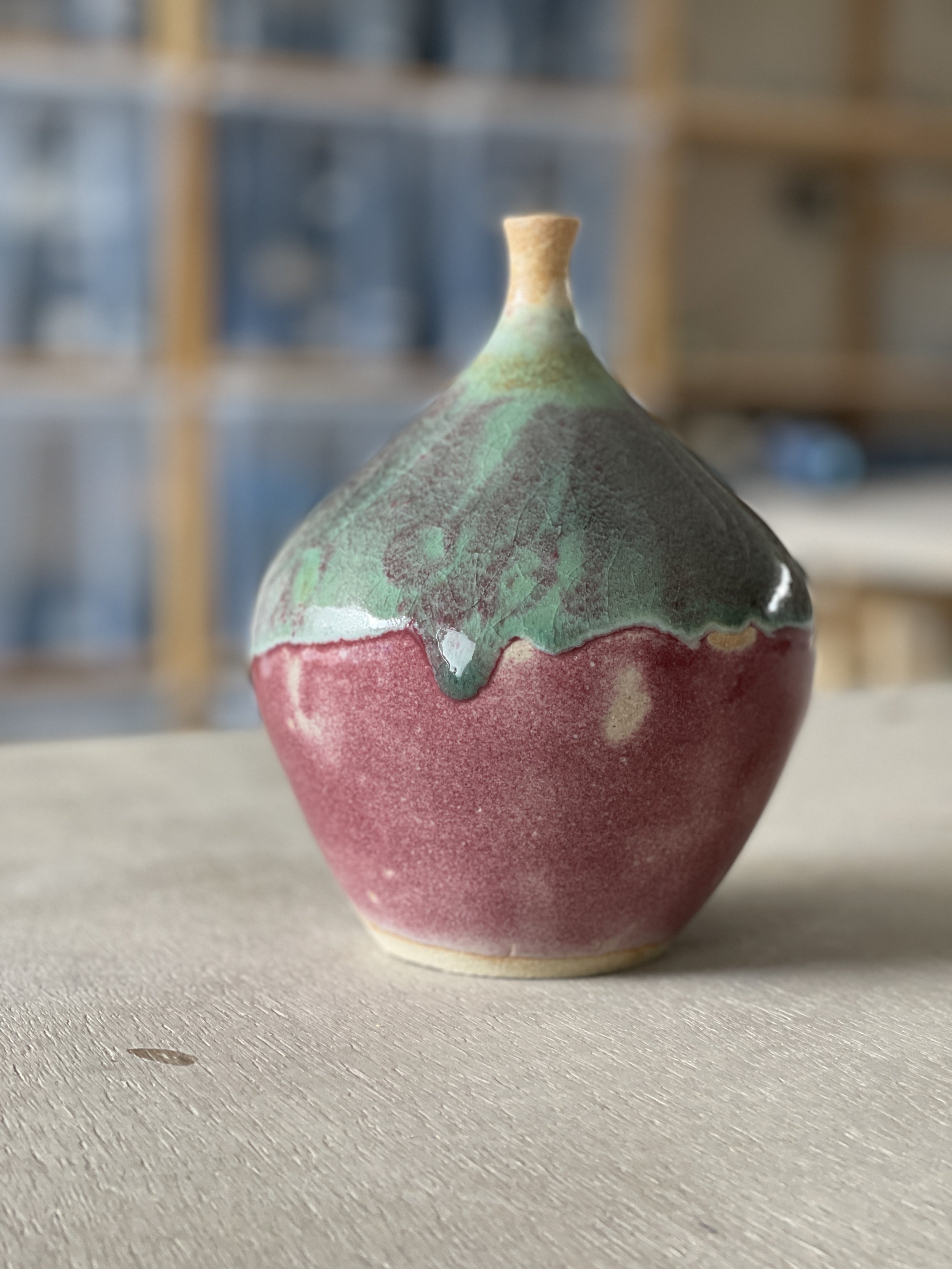
Overlaps with celadon produce this turquoise
That familiar orange hue is a nice feature of this glaze.
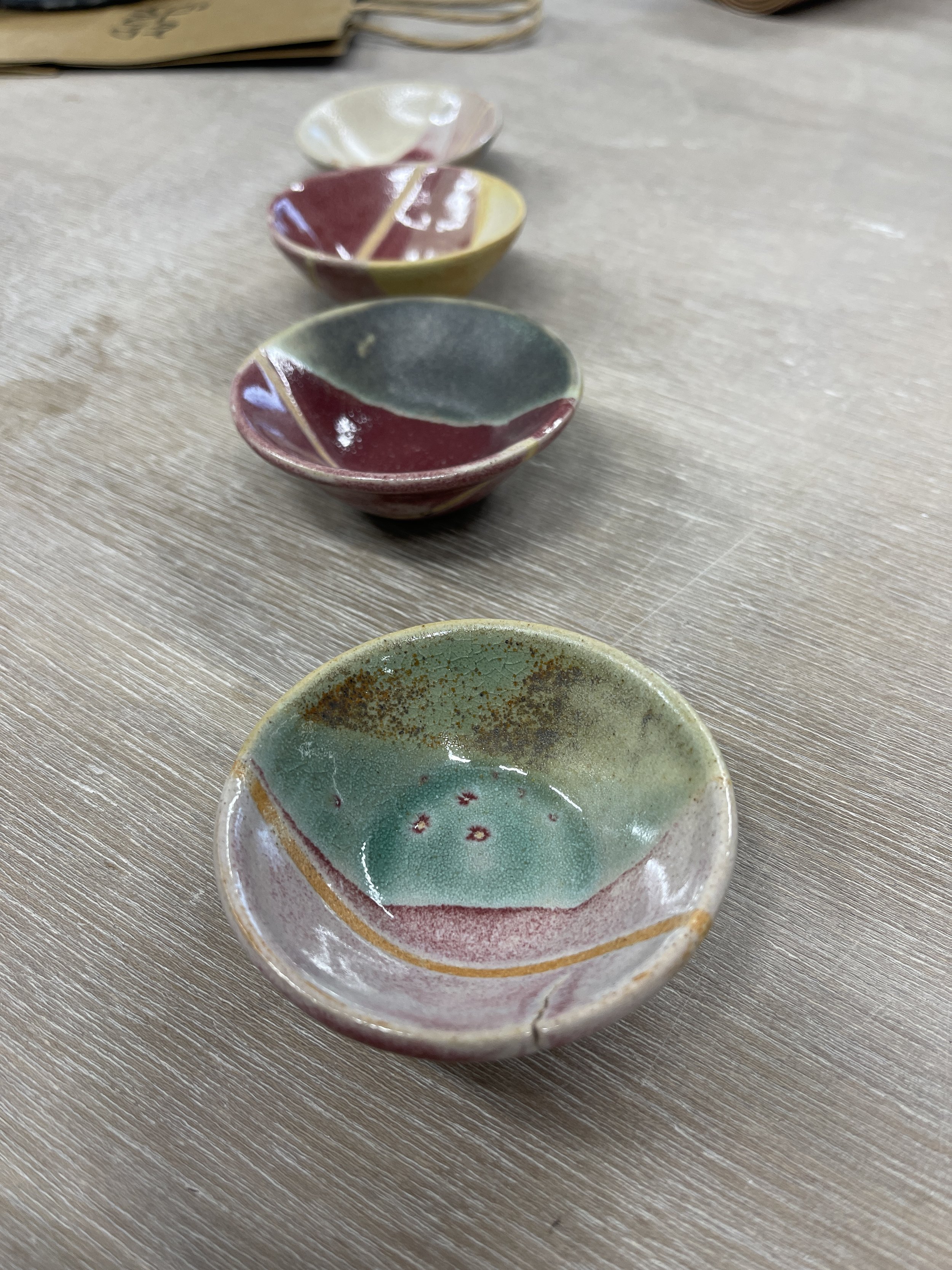
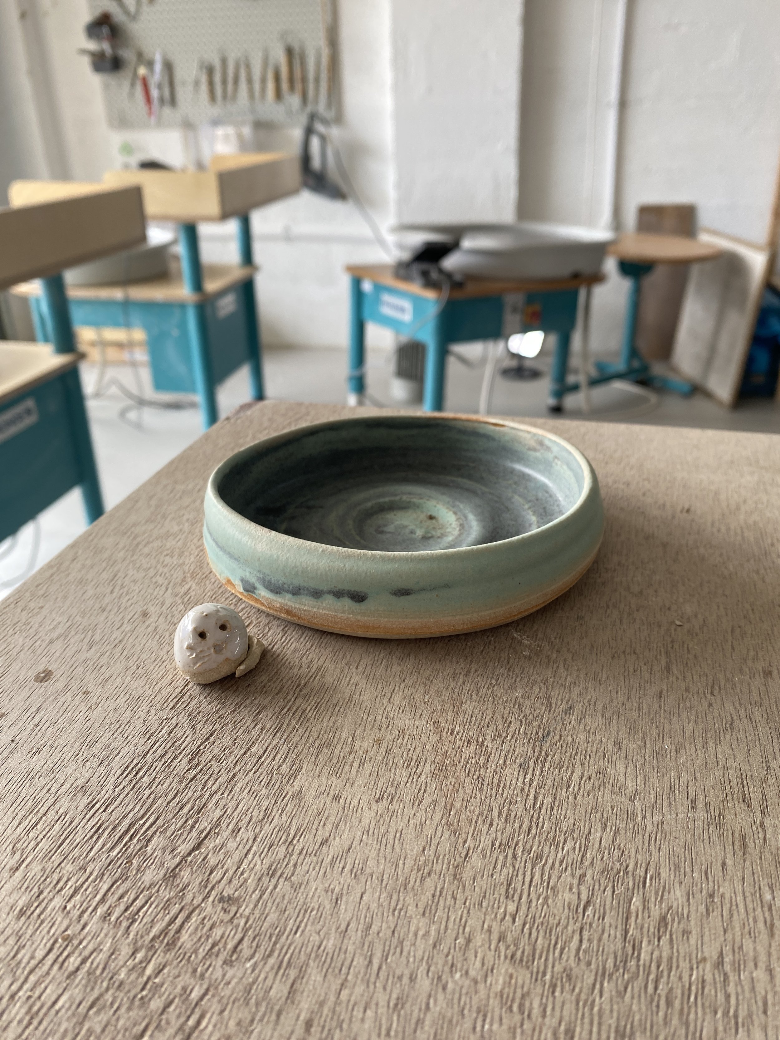
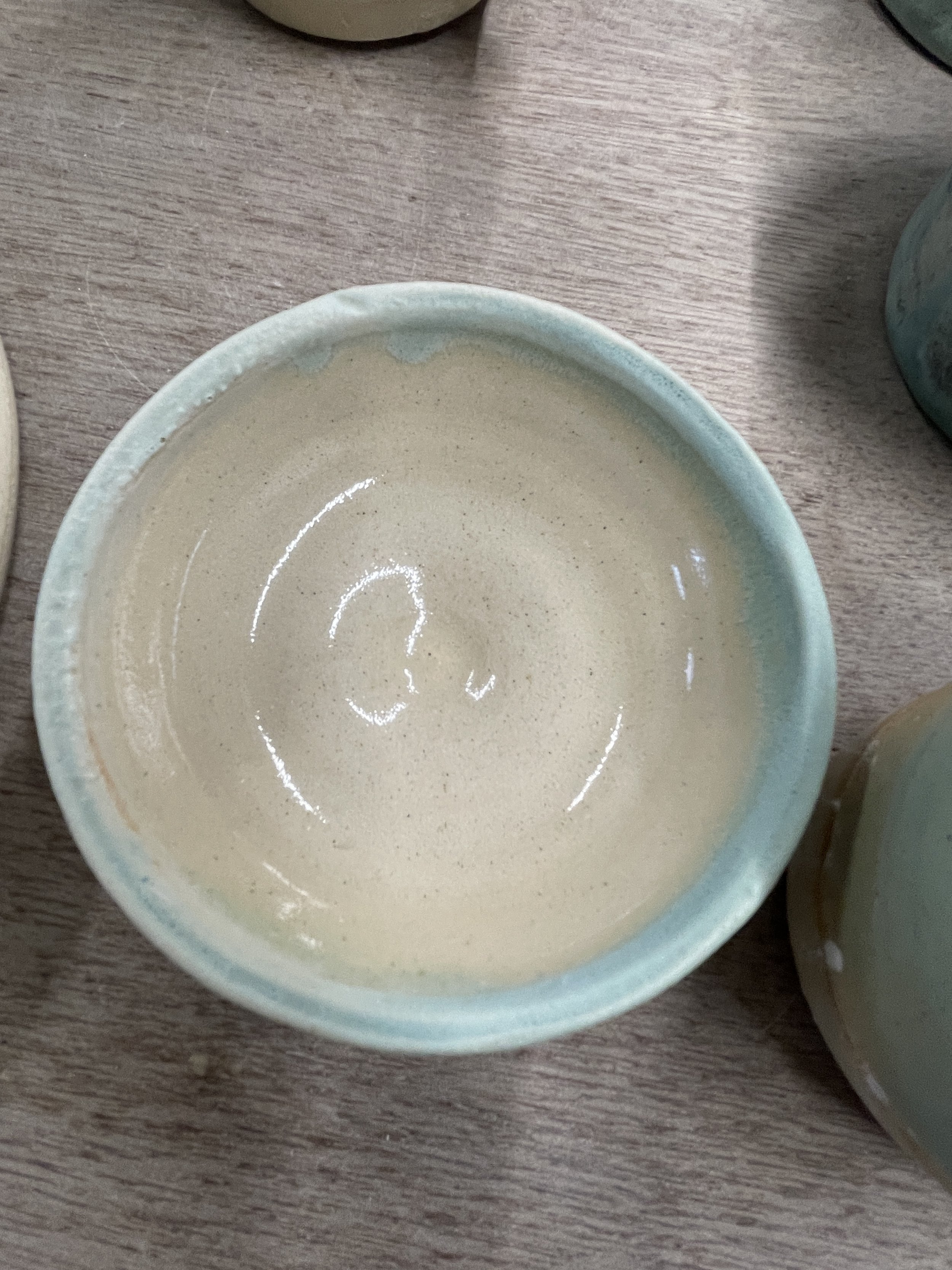
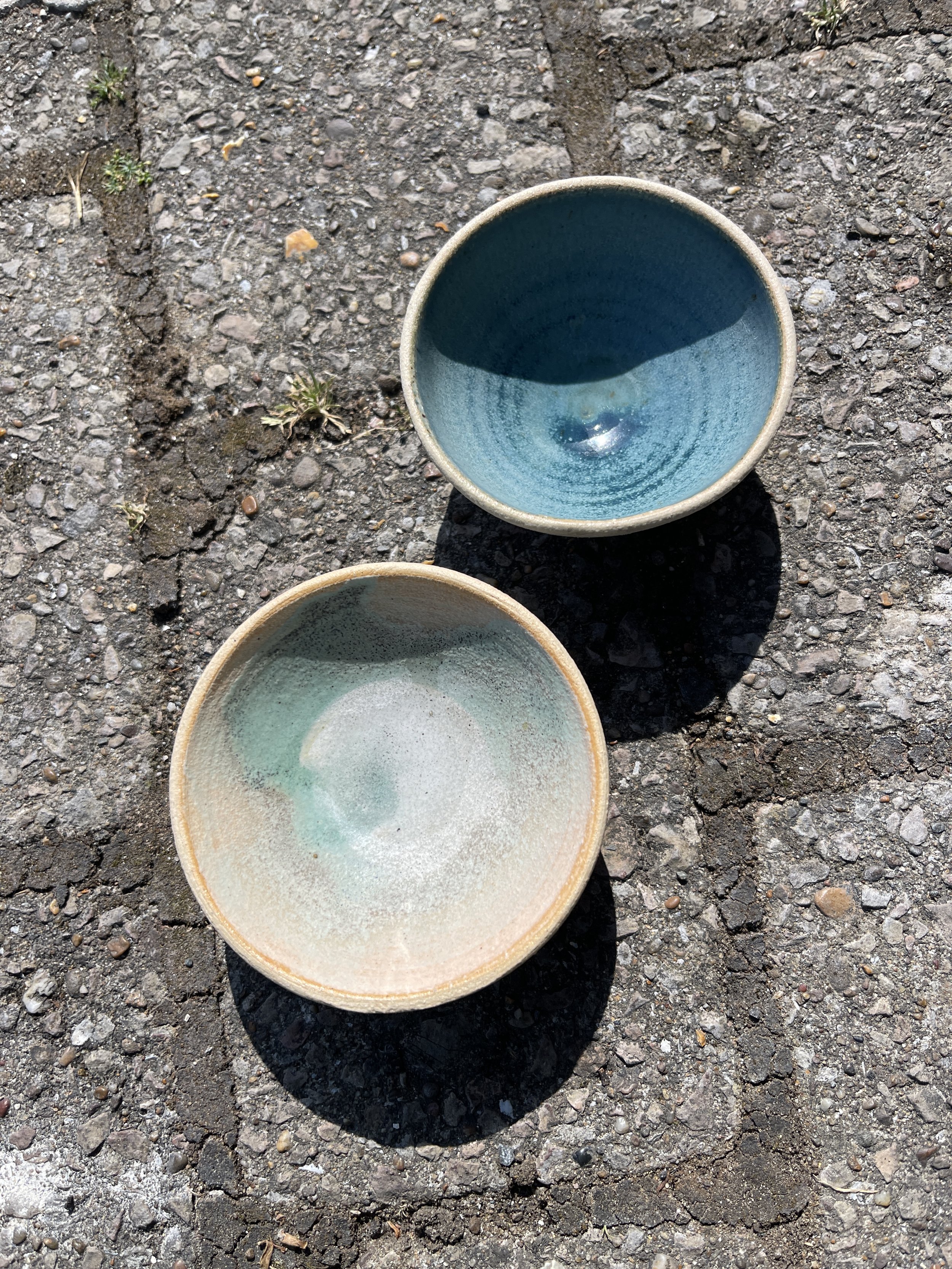
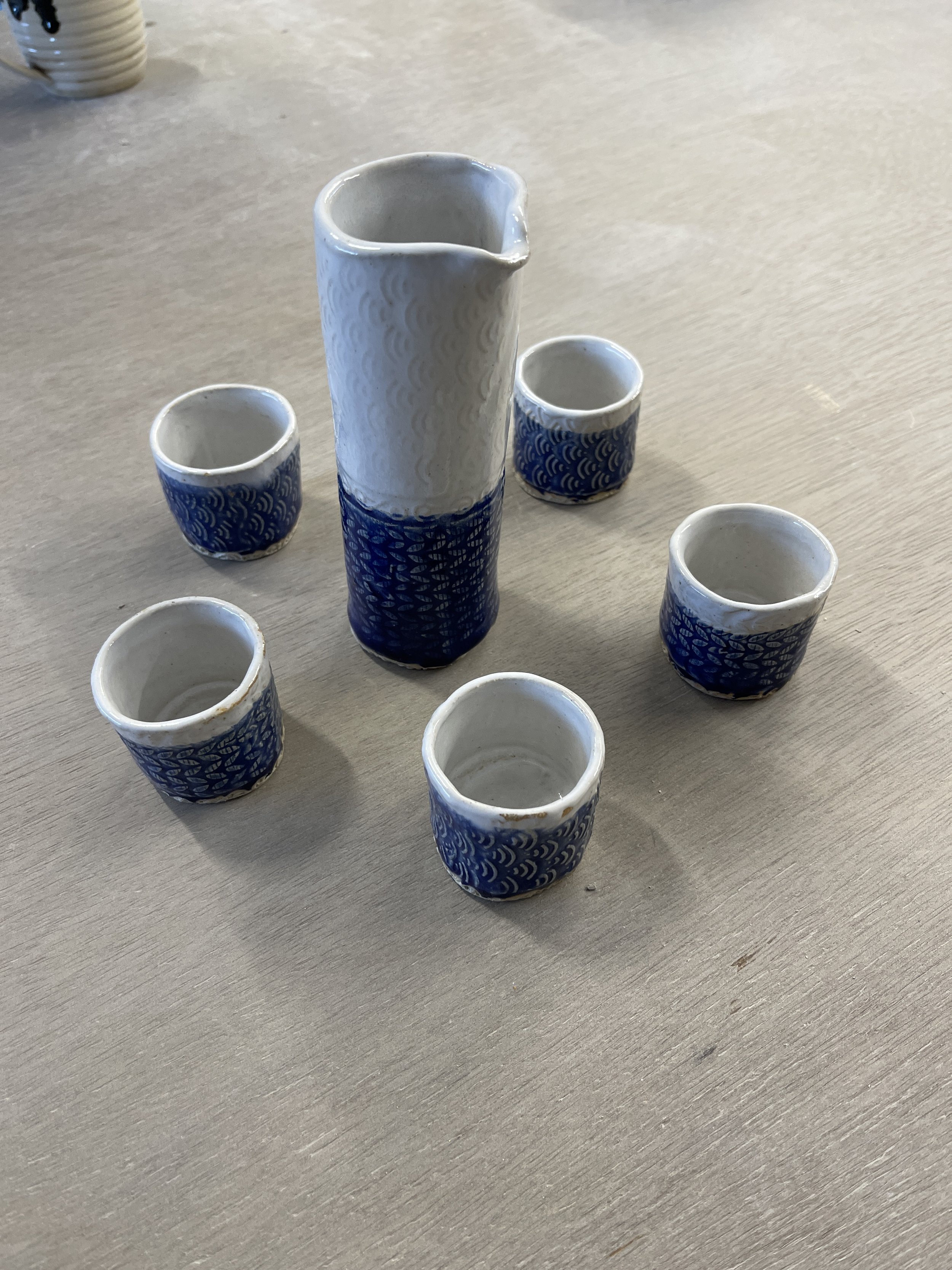
Nice glaze test dishes to highlight variations.
Glazed pots
Amaryllis Pink highlights texture nicely.
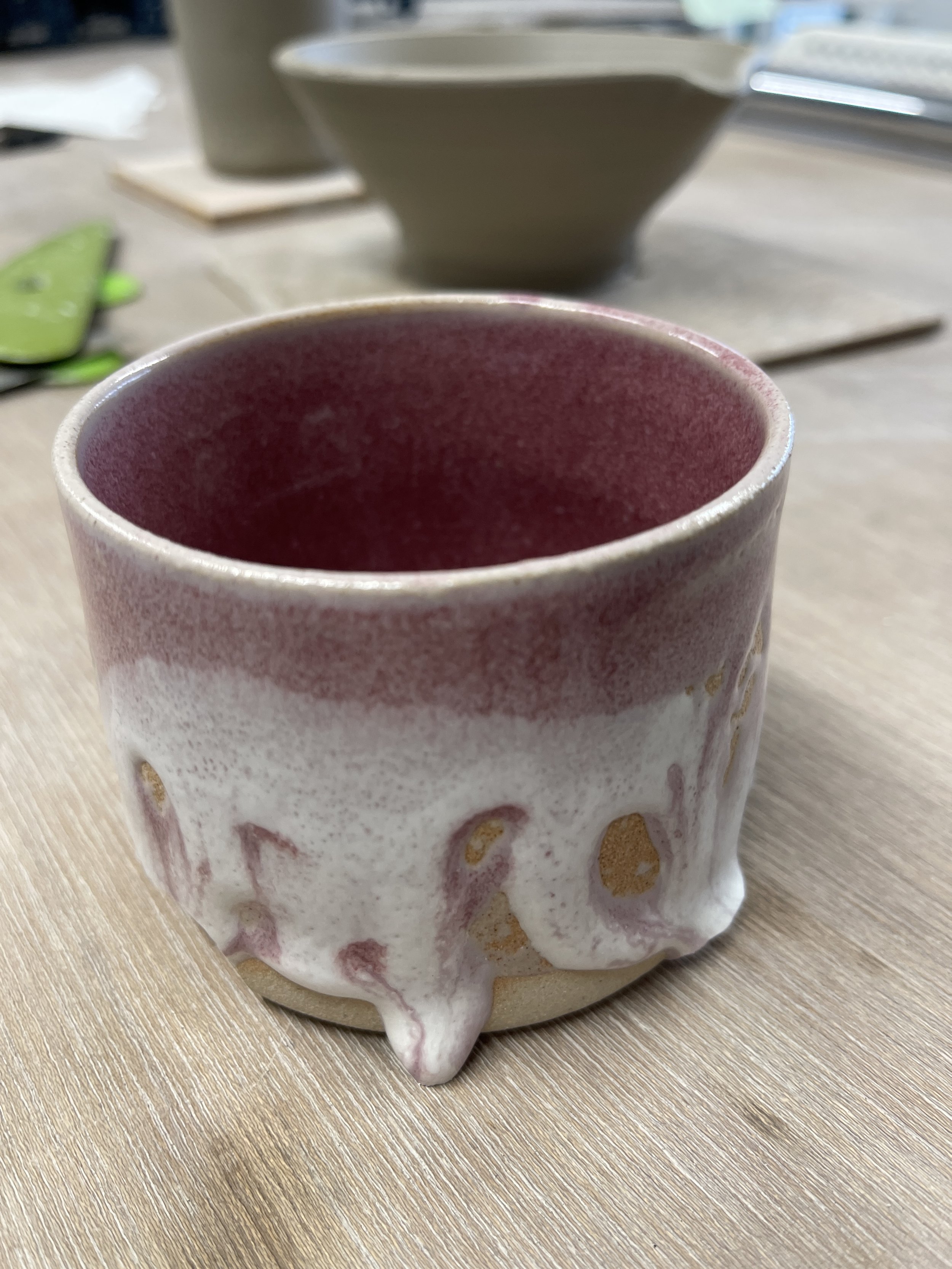
A crazy example of crawling... steer clear of white and pink. Doesn't work.
Risky gloop of celadon green.